
coca-cola freestyle
COCA-COLA Freestyle
CoCA-cola freestyle
Voron joined Coca-Cola in 2006 and accepted the challenge to build their first global design team and lead a multi-million dollar game changing innovation project for the beverage industry known as Coca-Cola Freestyle. Coke’s customers (restaurant owners) at the time were always demanding innovation. Coke was always trying to introduce more compelling reasons for a customer to choose a Coke or one of the Coke products. Innovation for variety was a big part of it, and consumers’ tastes have changed and expanded. They wanted variety and choice. Given the existing eight‐valve Legacy fountain system of the time, it was very difficult for Coke to get new products into the hands of their consumers, and given that the food service business is about one‐third of US Coca‐Cola consumption something had to be done differently.
Voron gave his new design team at Coke and their external design agency partners a few simple criteria for the design brief:
1/ The interface should not feel like an ATM, nor should it feel like a computer since getting a Coke should be pleasurable - not remind people of getting money or work.
2/ It should have the aesthetics of the great Coca-Cola form design heritage—and be alluring from 20 feet away, yet very personal close up.
He thought that brief was going to be easier to achieve than it ended up being. A lot of user interface in the design of the iPhone was computer-based or ATM-based, and we got a lot of options from our agency partners that did remind people of money and business transactions or computer work. That was exactly what we didn’t want consumers to associate with when engaging with our fountain machine. It took Voron’s team three years to prototype and several design iterations times to make it perfect.
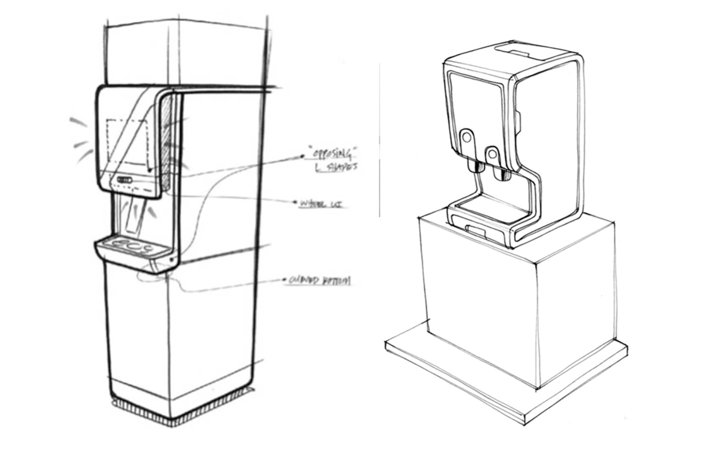
Early conceptual sketches
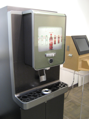
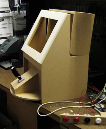
Early mockup and refined conceptual prototype.
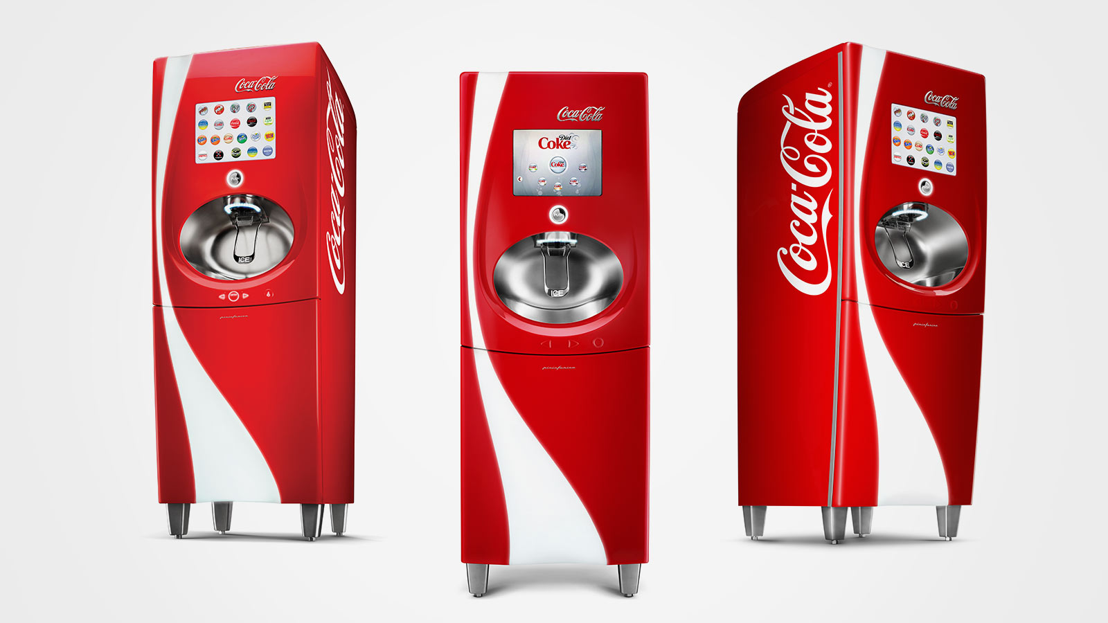
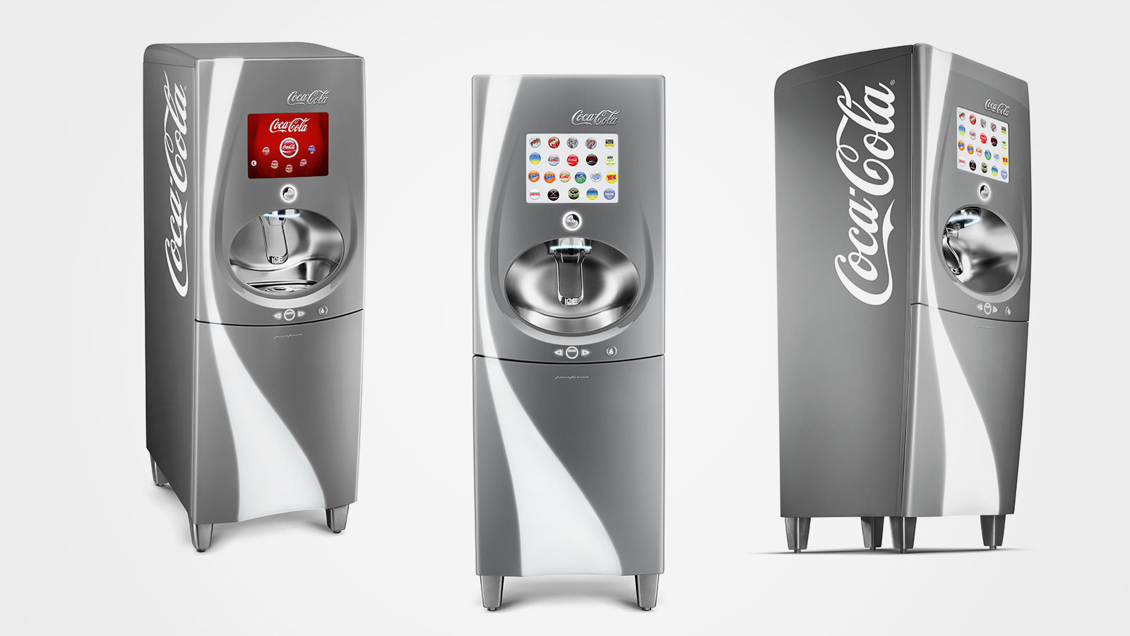
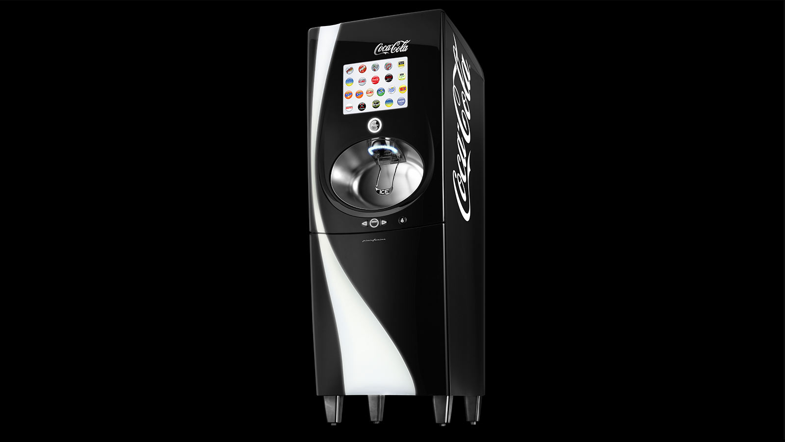
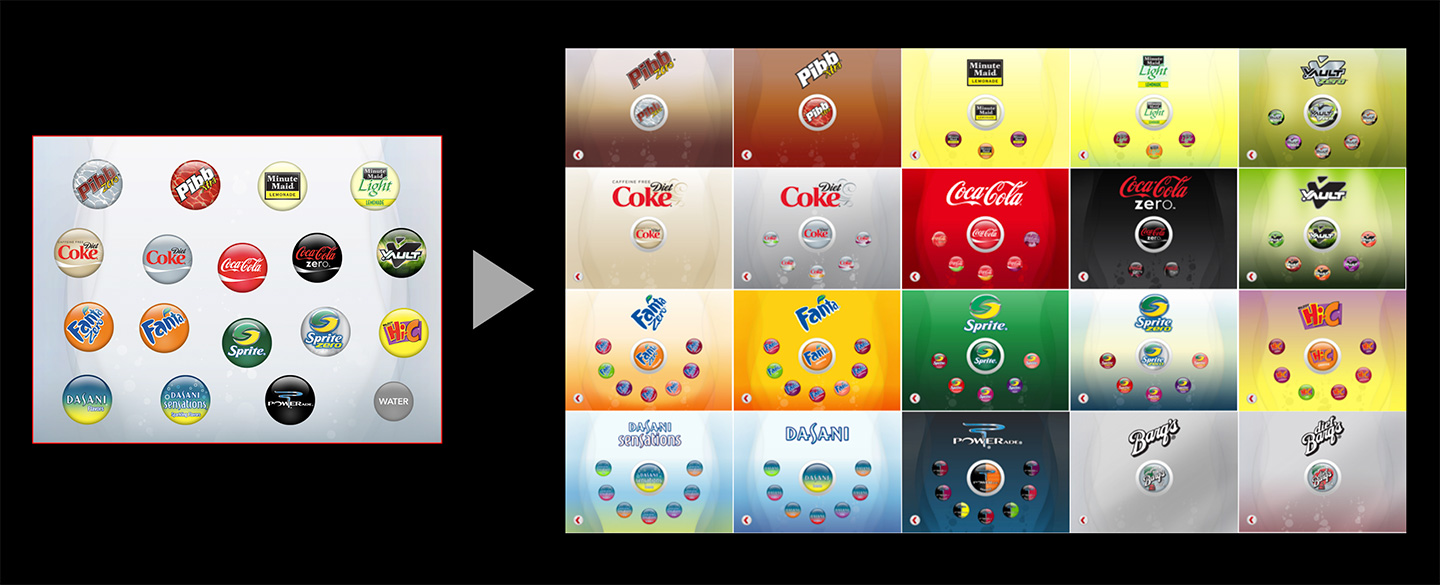
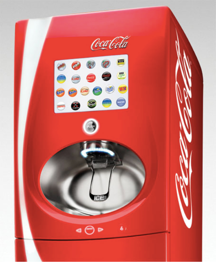
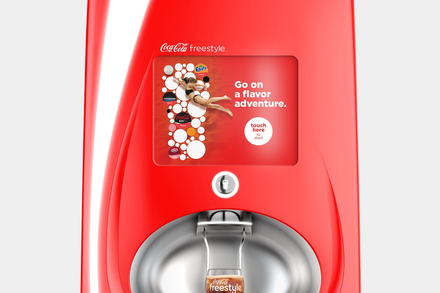
USER EXPERIENCE DESIGN: 100+ BRAND CHOICES
Creating a simple touch screen user interface for all ages.
USER EXPERIENCE DESIGN: 100+ BRAND CHOICES
Creating a simple touch screen user interface for all ages.
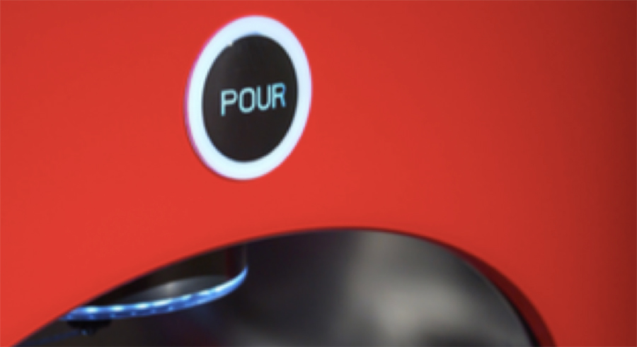
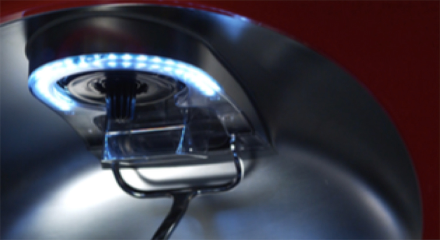
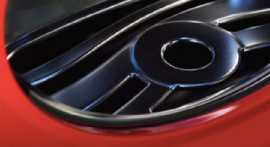
Exquisite Touch Points adorn the Freestyle User Interface
Throughout the project, whenever Voron’s team needed to make a compromise, the joke was that the process is sort of like design strip poker. And the last thing you’d take off if you were playing strip poker would be your jewels. Those are the things the design team really fought hard to preserve. He truly believes that a machine can be copied, but that execution of those jewel‐like elements—which become branded elements—is really powerful and make it hard to copy.
One other key point on how Voron’s team experimented internally with their design strategy, instead of starting to design what the elements look like, they first went to the bill of materials to understand, what do all the existing traditional elements cost? What does an ice lever cost? What does a nozzle decoration cost? What does a drip tray cost? Then, using their design experience from other industries they knew they could product a drip tray, that at the time looked like a barbeque grill rack, much more exquisite for the current cost of $25.
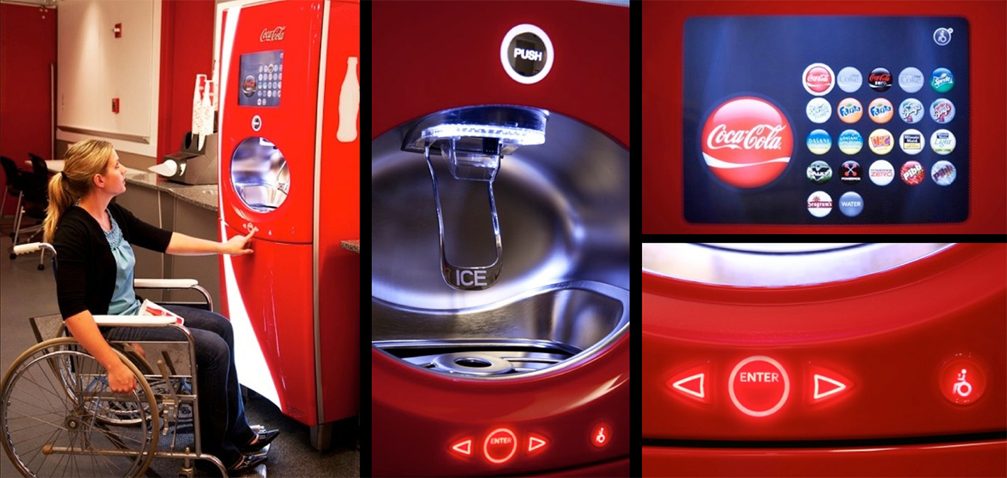
Joy at Every Touch Point
The touch screen technology had to be inviting and intuitive to everyone in the common marketplace of the food service establishment, and a great deal of internal consumer testing was employed to ensure that it was.
One of the other user interface devices his team was proud of and they went above and beyond with was our ADA interface. A lot of banking machines, etc. will incorporate these ADA devices later—they tend to be things that aren’t very well thought out, typically slapped on at the end. When Voron’s team was designing the touch screen user interface, they designed a secondary user interface that is below the ellipse area, in the center panel, for seated handicapped users. We used a dead‐ fronting technology, as used on dashboard odometers. It doesn’t come to life until light is emitted behind it. They didn’t want physical buttons there because it’s below the ellipse, and liquid might get into them. There’s a little wheelchair symbol on the right‐hand side of the main panel, and it’s always illuminated. When you press that, that lower center console lights up and there’s a specialized user interface screen that comes on. You can toggle it from down below, and pour your drink. You don’t have to go above the ellipse area at all.
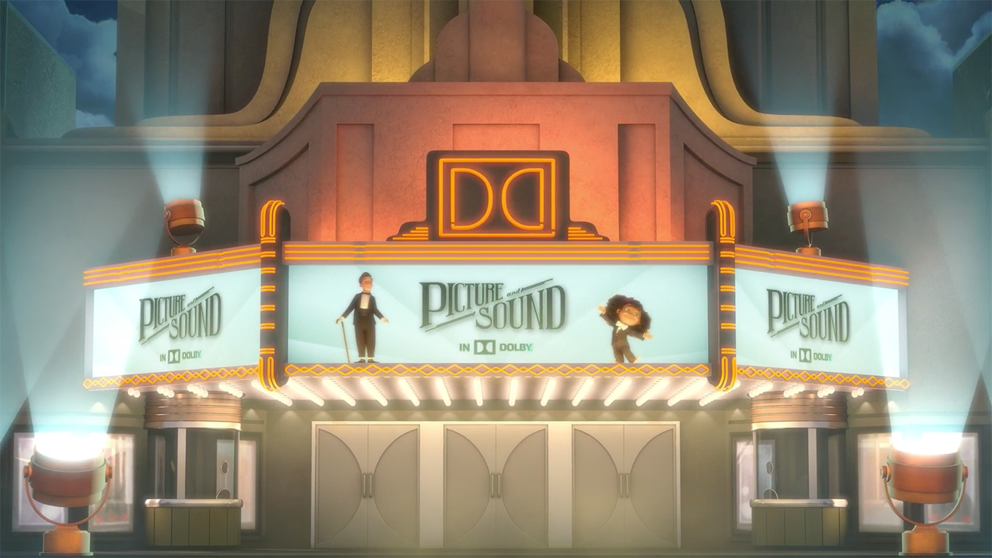
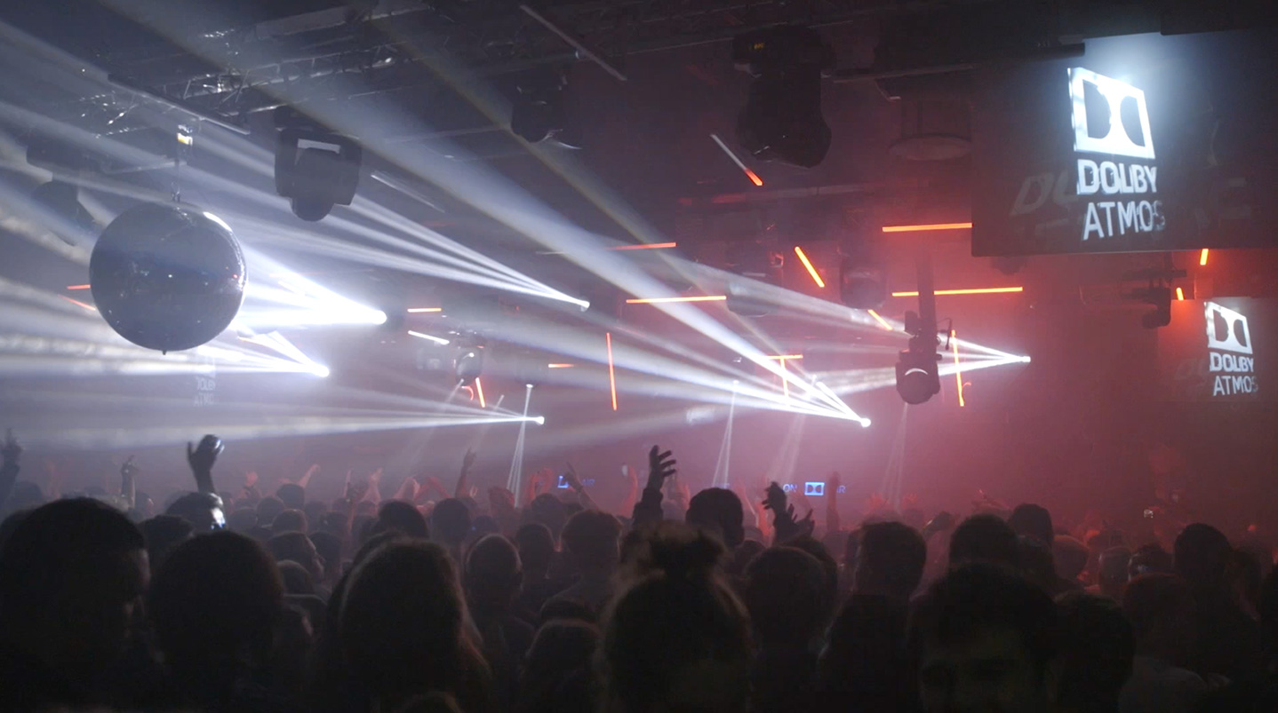
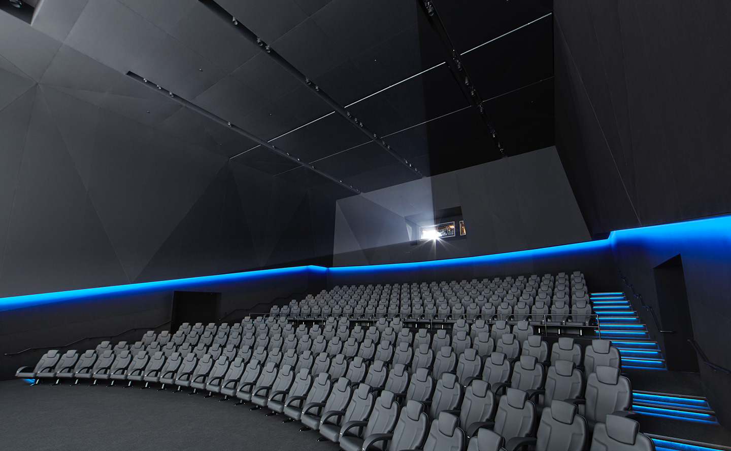
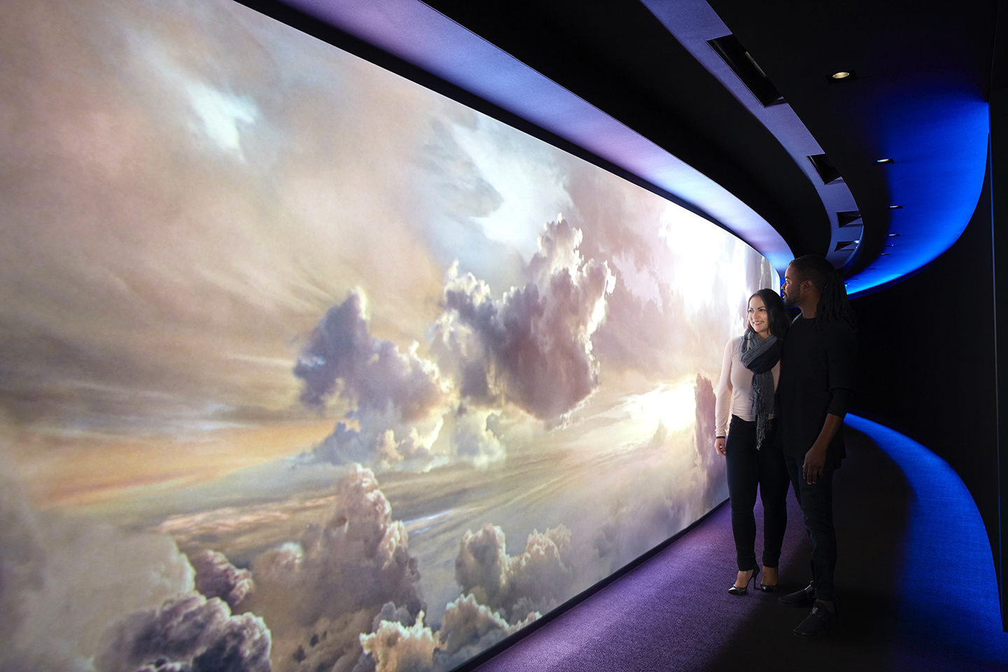
Other Work
Ripple Got It CampaignRipple
Dolby Brand Design SystemPayID Product & Brand Design
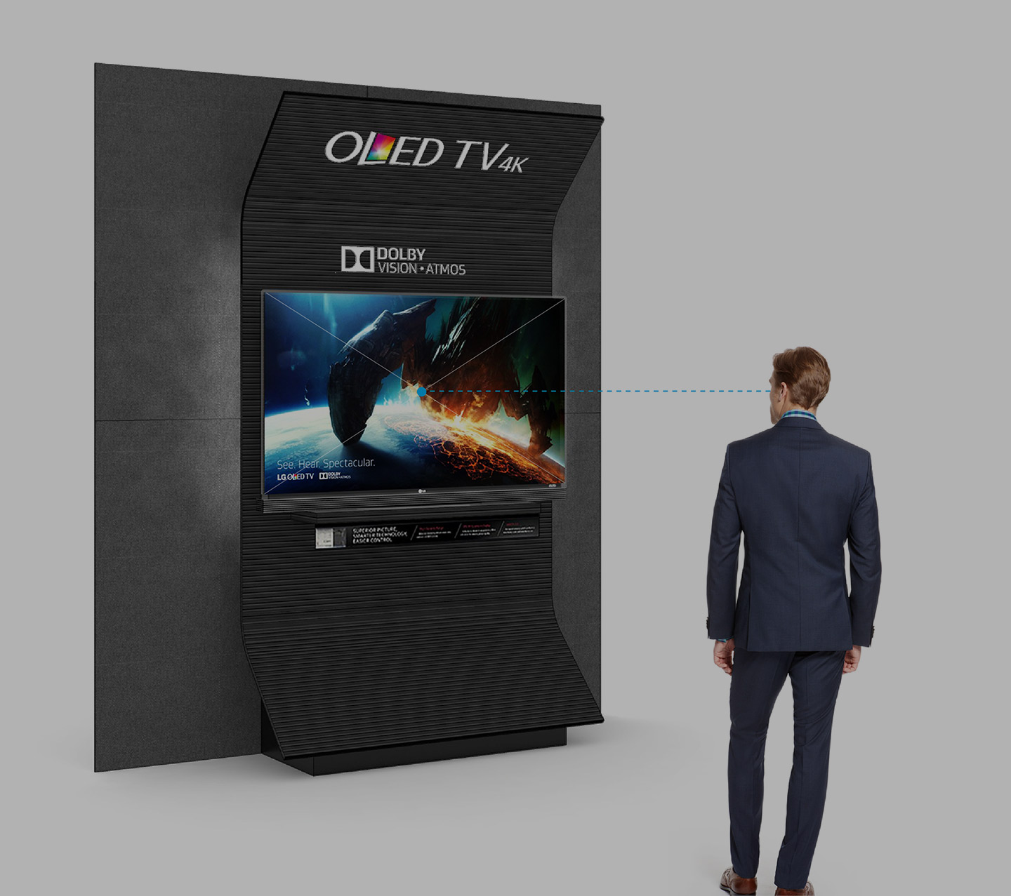
Dolby UX/UI DesignDolby
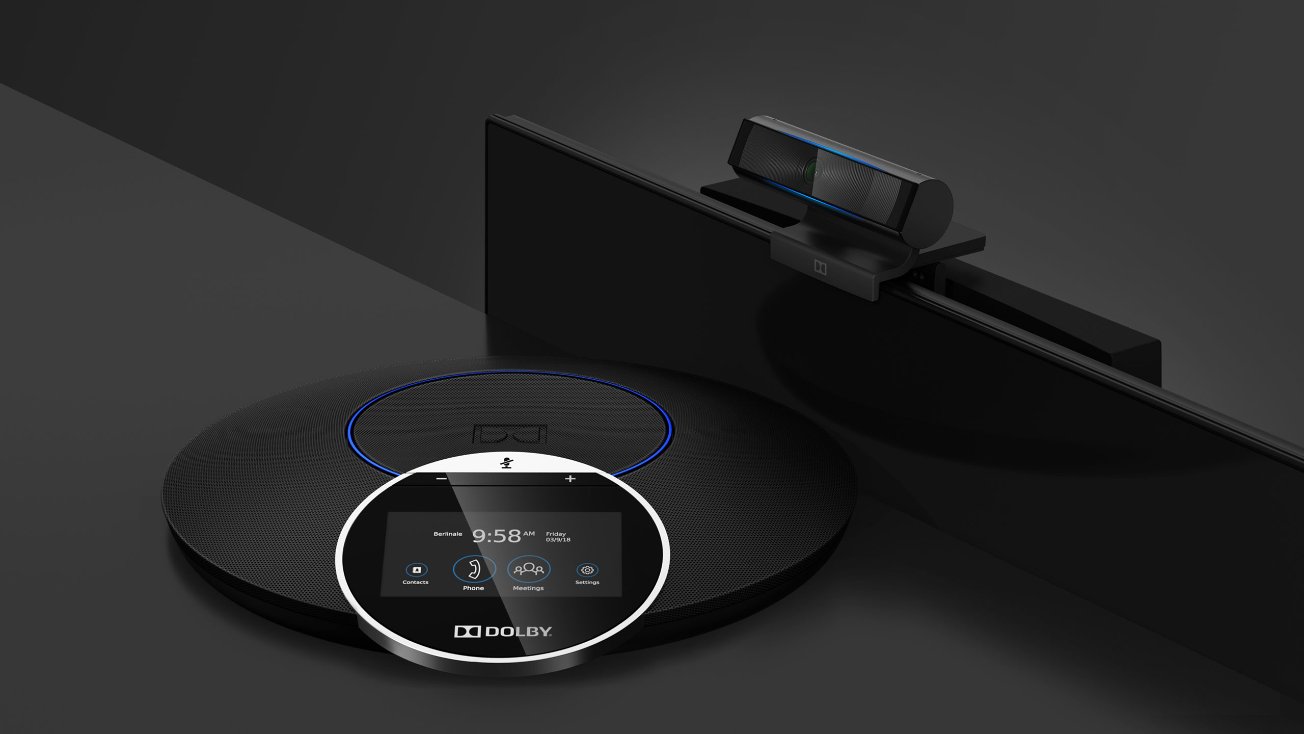
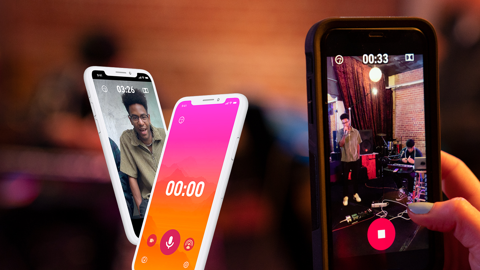
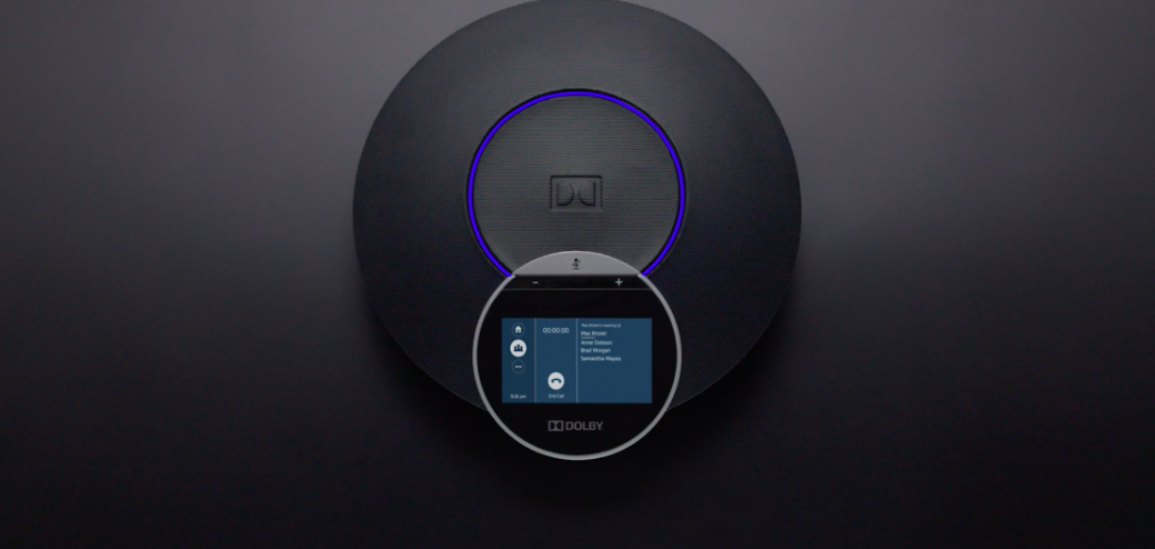
Dolby VoiceDolby
EscapeDolby

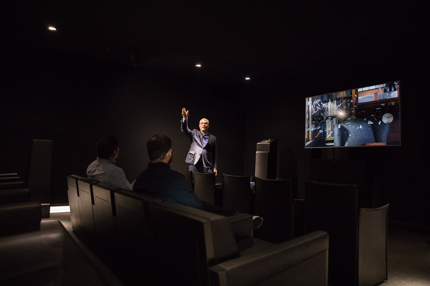
Dolby CinemaDolby

SilentDolby
Dolby SohoDolby
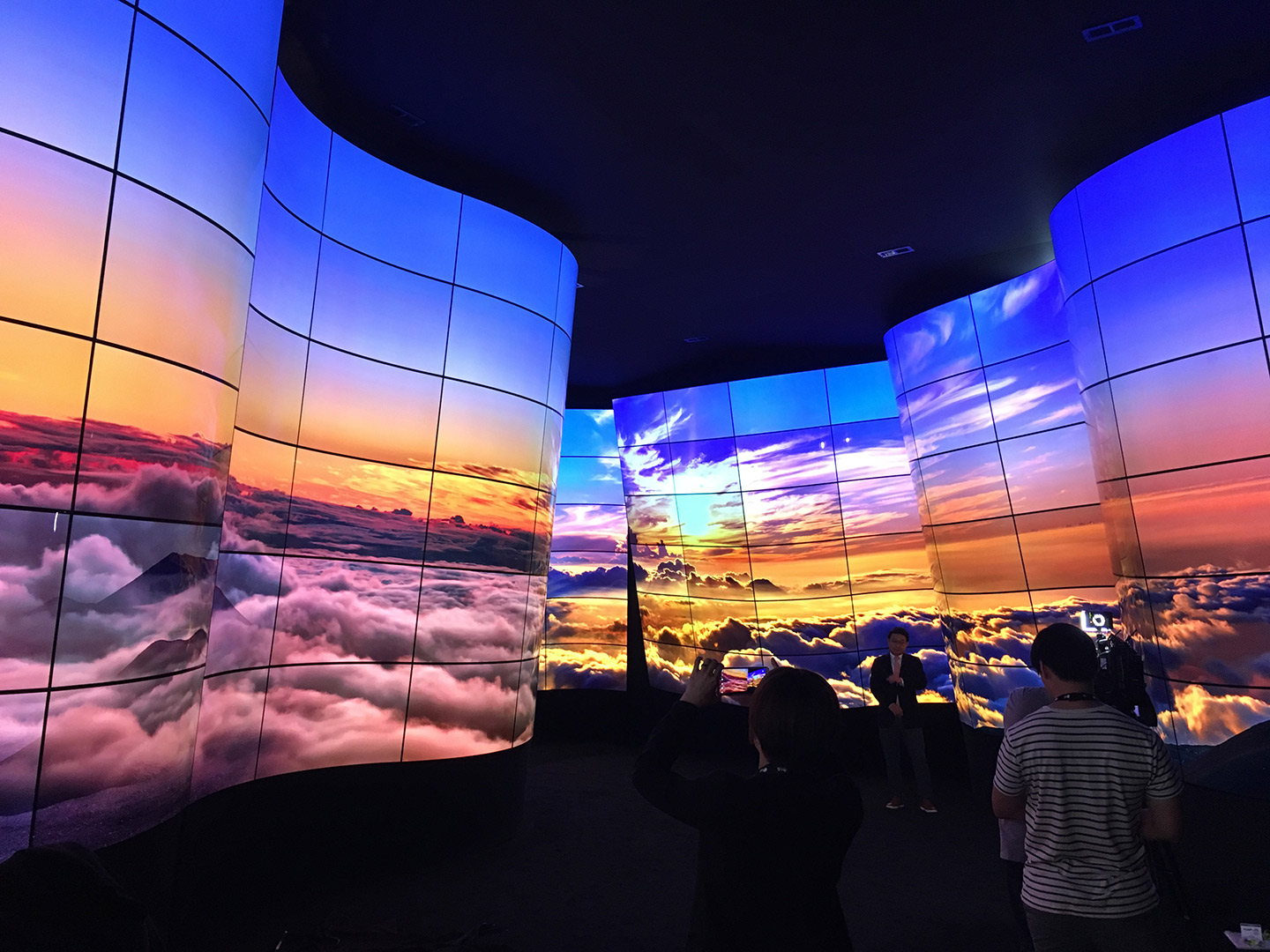
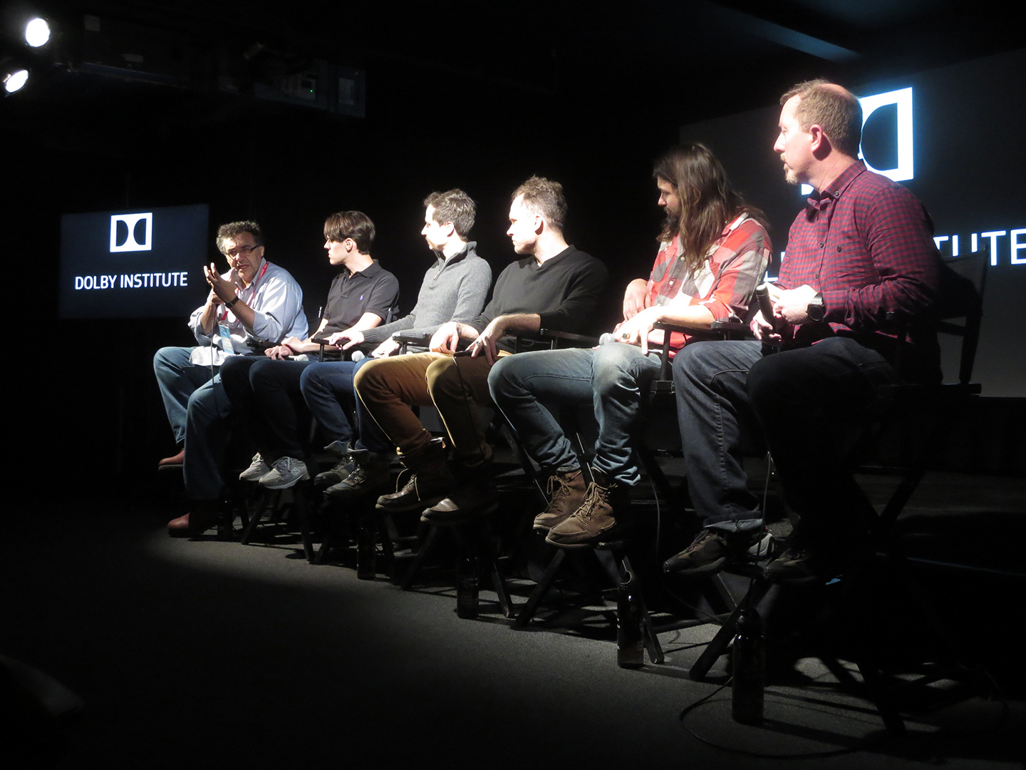
Dolby InstituteDolby
Dolby Art SeriesDolby
Dolby PhotographyDolby
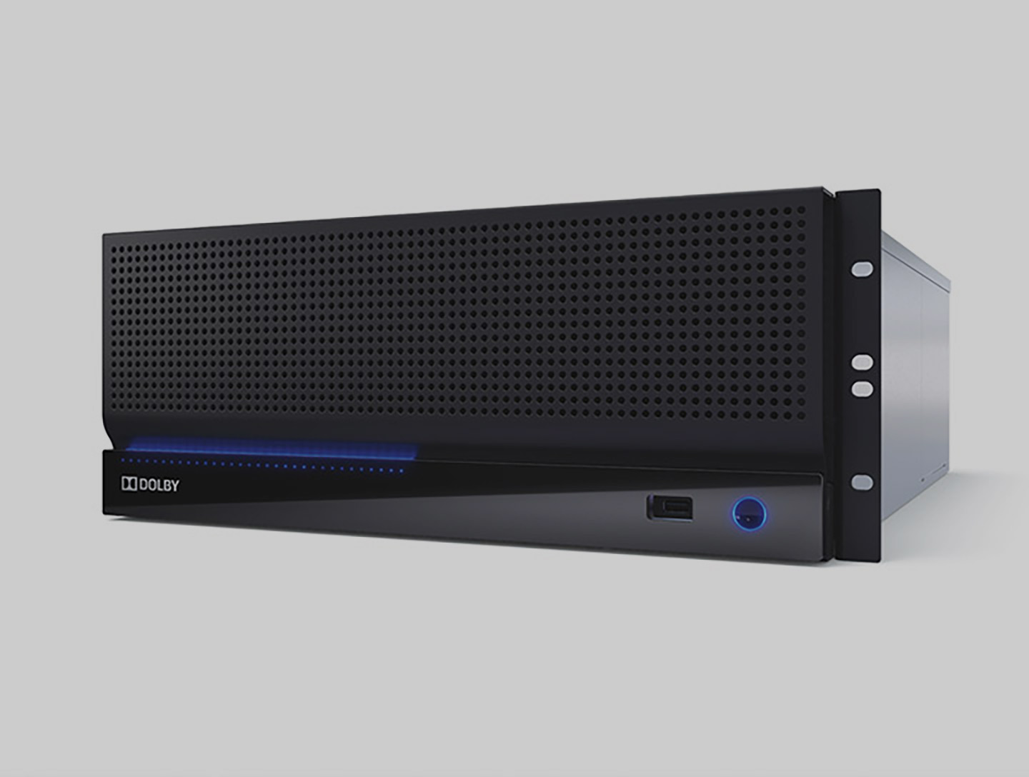
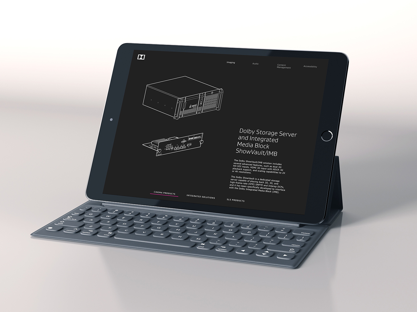
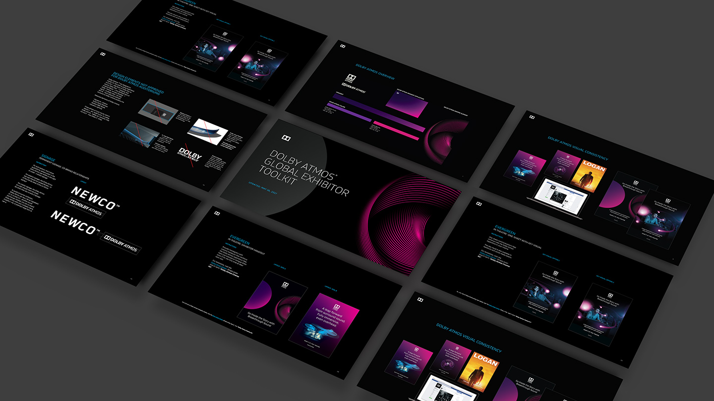
Partners ToolkitsDolby
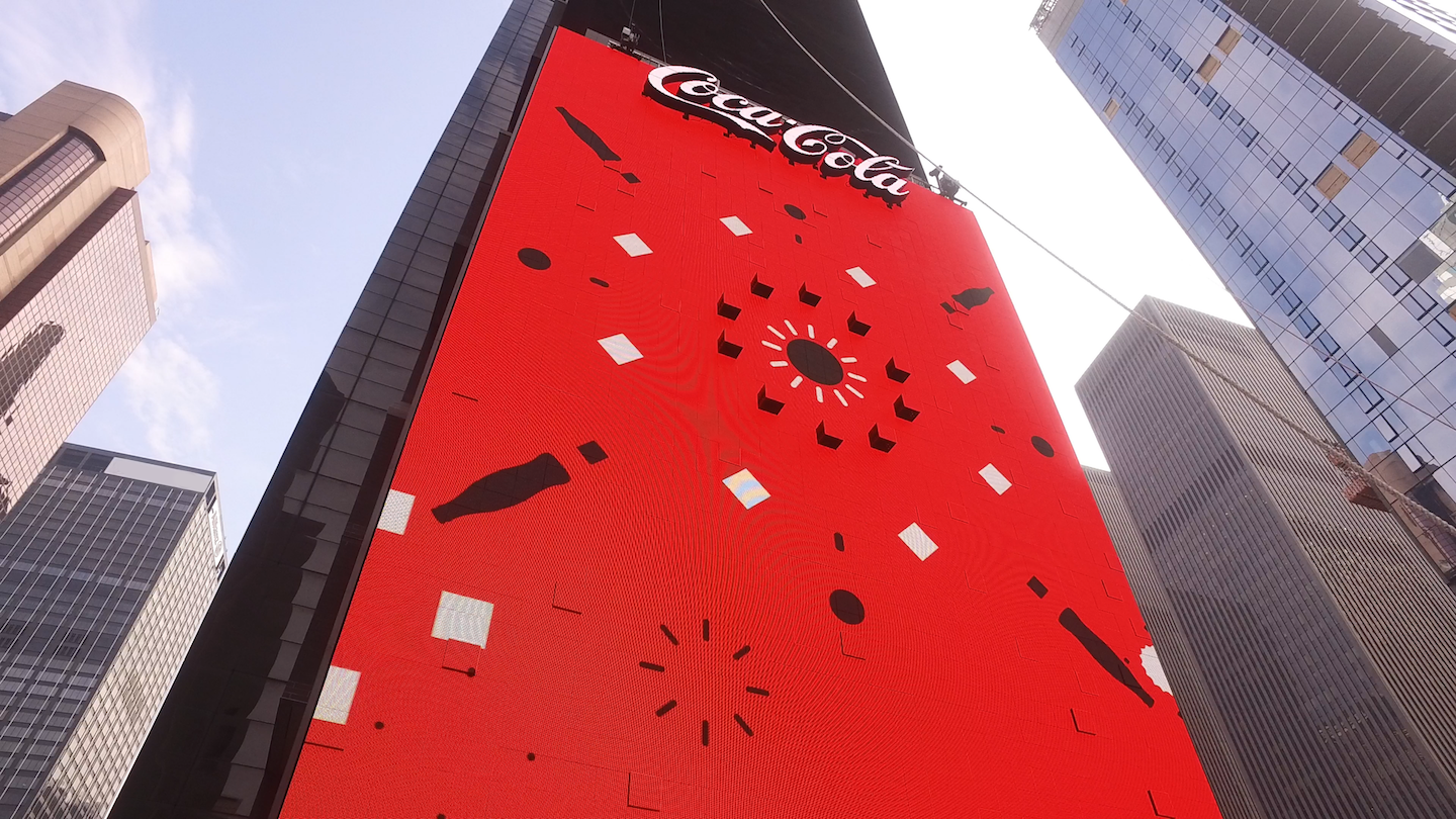
Times Square Interactive BillboardCoca-Cola

Coke Brand Design SystemCoca-Cola
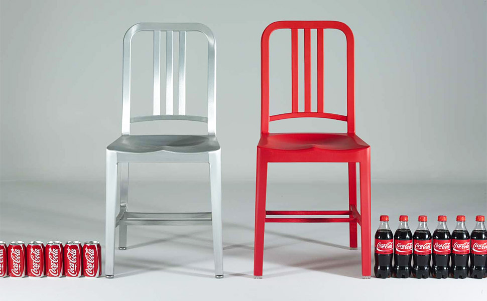
EMECO COKE 111 NAVY CHAIRCoca-Cola
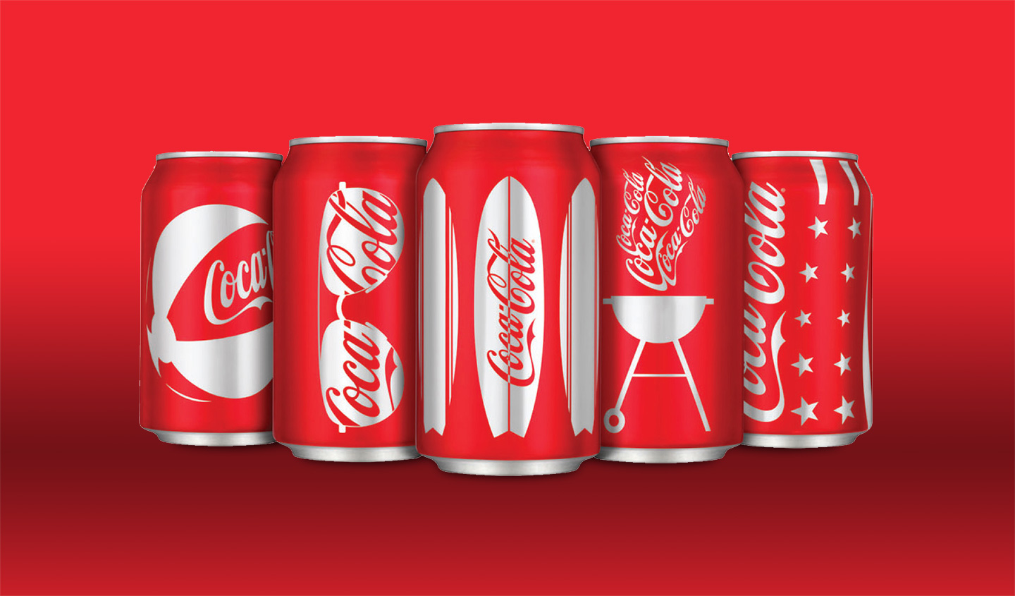
Coca-Cola PackagingCoca-Cola
Coca-Cola EquipmentCoca-Cola
Coca-Cola Digital DesignCoca-Cola
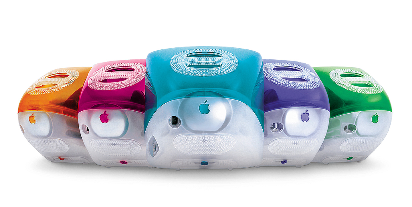
Apple ArchiveApple
Apple is a registered trademark of Apple Inc, Coca-Cola is a registered trademark of The Coca-Cola Company, Dolby and the double-D symbol are registered trademarks of Dolby Laboratories.Hey there, this is the default text for a new paragraph. Feel free to edit this paragraph by clicking on the yellow edit icon. After you are done just click on the yellow checkmark button on the top right. Have Fun!