
RIPPLE DESIGN SYSTEM
Dolby Vision Brand Design
RIPPLE BRAND DESIGN SYSTEM
When Voron joined Ripple in 2019, he quickly realized that the Ripple brand, well recognized globally in the crypto space, was diverging from the intended master brand strategy that was developed in 2015. Through an audit that his team performed of all of the customer and consumer touch-points, it became clear to him and the senior leaders that the five verticals of the company needed a strategy to realign. Ripple has valued the importance of brand and design since their inception in 2012. Although they had always strove to maintain a cohesive and engaging experience across every touch point, over time, points of view of the general managers of the different business units inadvertently shifted the look and feel of customer experiences. The look and feel of the customer experiences become more aligned around the org structure versus holistic customer experience strategy.
Great creative starts with insightful, clear strategy. Whether working with internal marketing teams or external agencies, Voron's design team at Ripple realized they needed a single briefing document for each brand that would ensure consistent communications. Voron’s team built a process referred to as creative clarity briefs to articulate the creative strategy on each platform brand with a “red thread” from marketing objectives through insight and core creative idea to touchpoint mapping, messaging, and creative execution.
Voron's multidisciplinary design team at Ripple found that creating these systems brought teams together around a single idea and execution style, and the strategies they map out drove more cohesive and considered creative work. These systems also provide a readymade capture of all the essentials for any external agency we work with, so any extensions of the internal design team would also have the knowledge they need to drive a coherent strategy.
The design system has provided Ripple's marketing and product designers with the guidance needed to implement the overall look and feel of the brand. In system, along with the distinguishing elements that apply to the new platform brands that were developed under Voron’s leadership, was launched in 2021. One can also find Voice Principles and Content Strategy guidance for developing product and marketing content within Ripple's first design system. Maintaining consistency and showing the brand in its best light in every application was a key factor in achieving the goal of making Ripple brand an iconic one. The new Brand Design System was leveraged for the redesign of ripple.com that was launched in 2022. It also guided the redesign of XRP.org in 2021.
Ripple’s first Brand Design System and Brand Strategy was crafted and executed in less than 18 months by the internal design team without any support from external agencies.
Dolby Vision “Reveal More” Campaign Assets
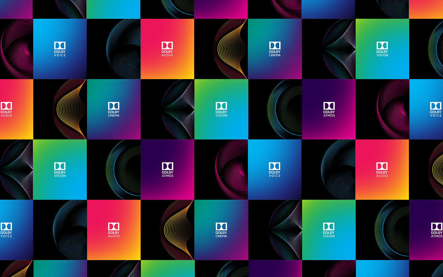
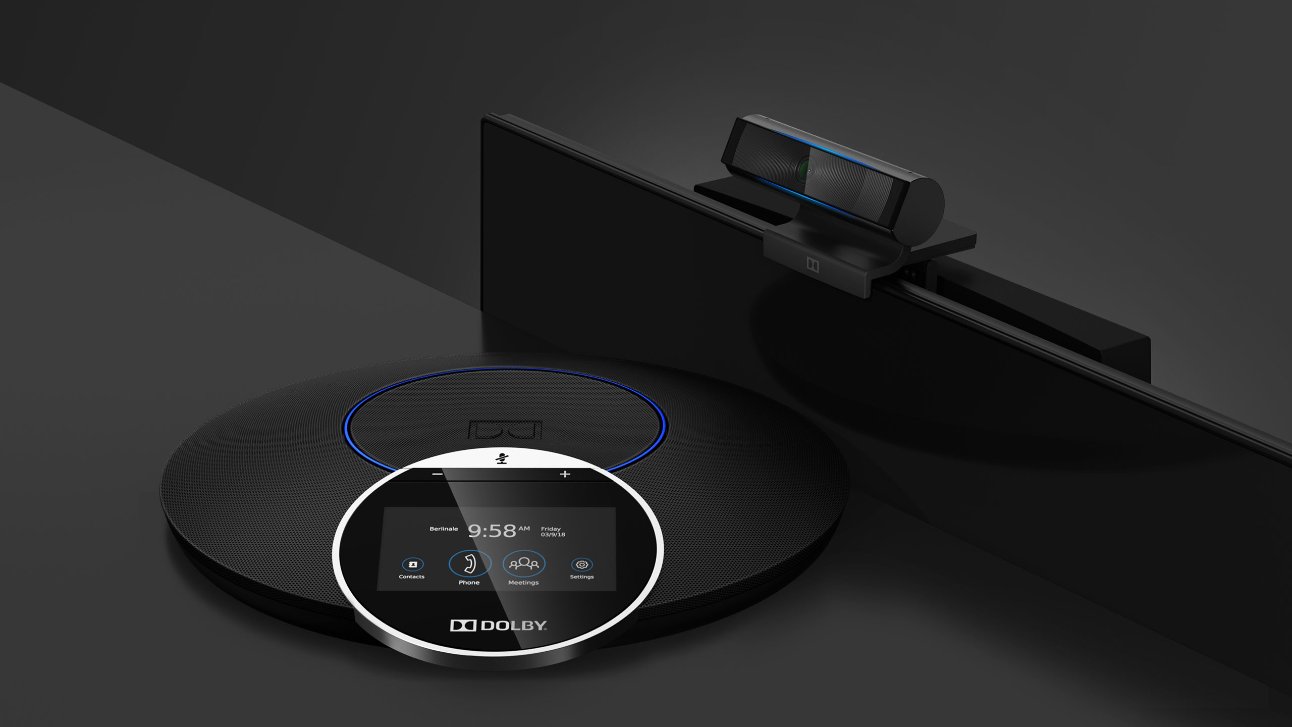
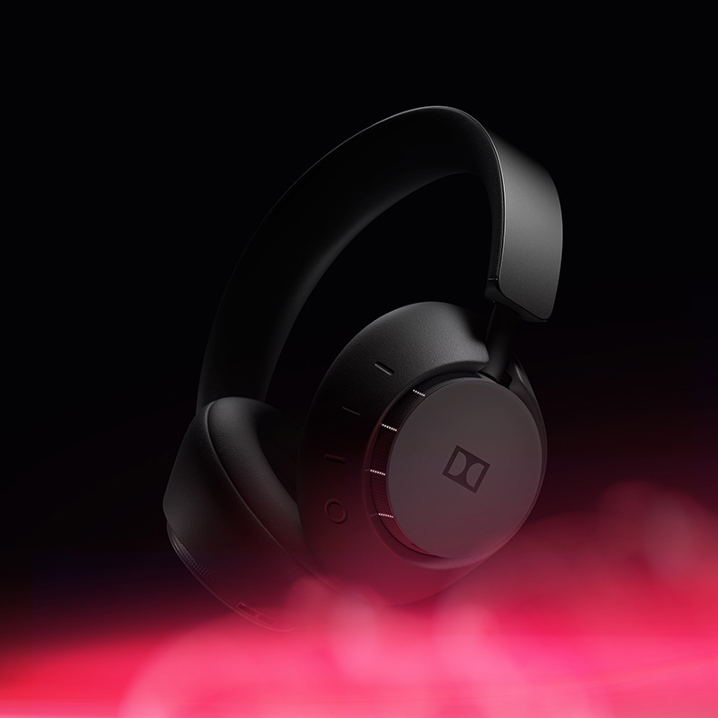
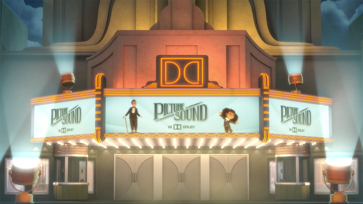
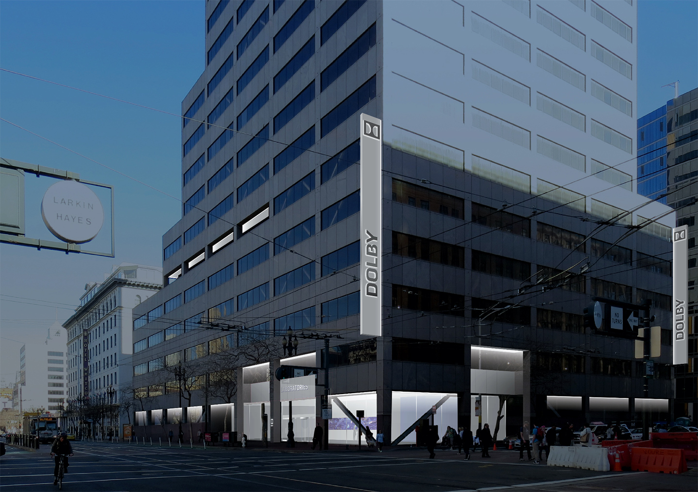
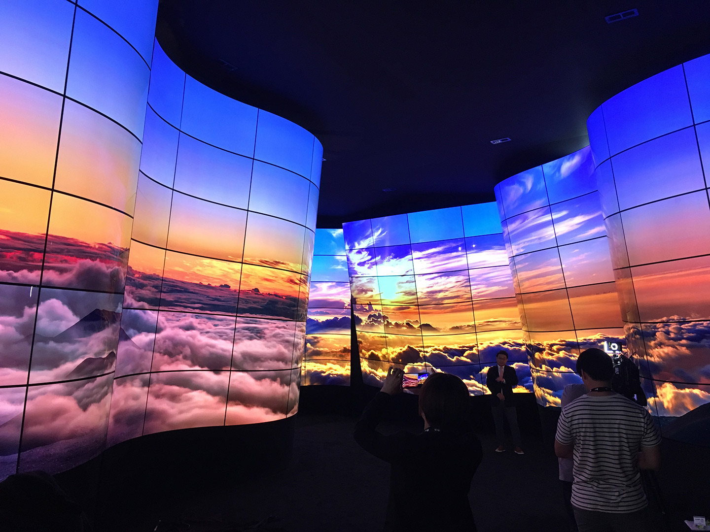
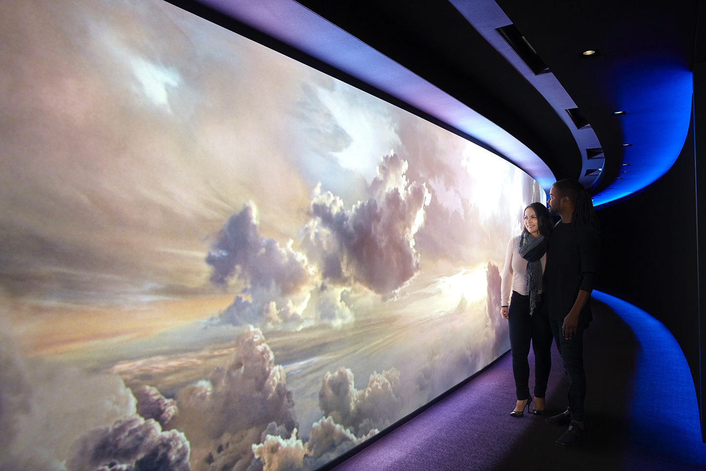
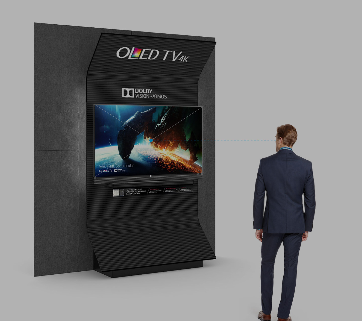
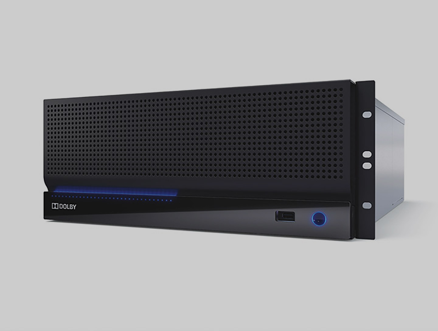
The majority of Dolby’s revenue comes from licensing audio and imaging technologies to global consumer electronic brands. These technologies enable content to be delivered to consumers from devices that produce the most immersive and lifelike cinematic & episodic experiences. Dolby’s imaging technology, Dolby Vision, empowers televisions, tablets, PCs and phones to deliver images and visual stories to consumers that have the highest contrast ratios, the highest amount of brightness and colors in the industry.
Given the importance of the B2B licensing business to Dolby’s bottom line, Voron’s team worked hard to create co-branded B2C consumer advertising and marketing content campaigns that their B2B partners could leverage directly to differentiate their product offerings and branded imaging features at the point of sale.
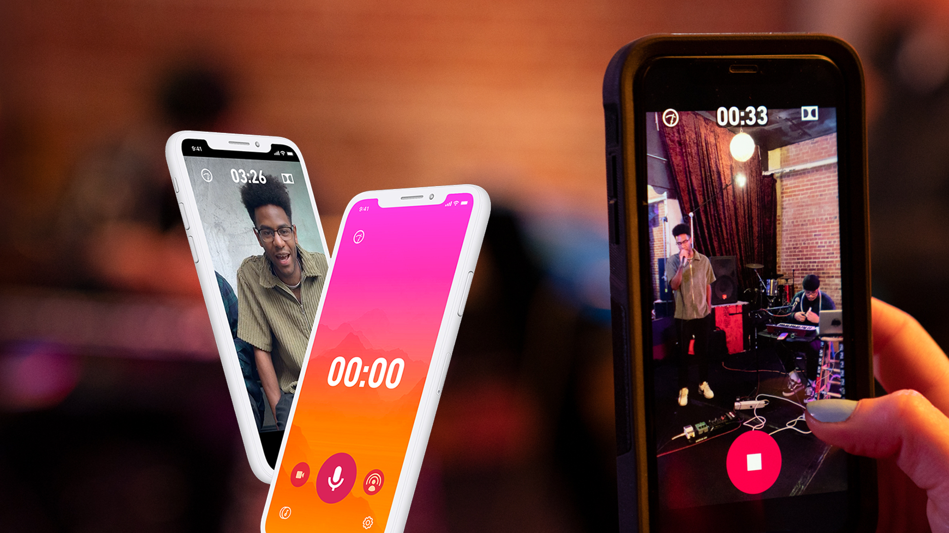
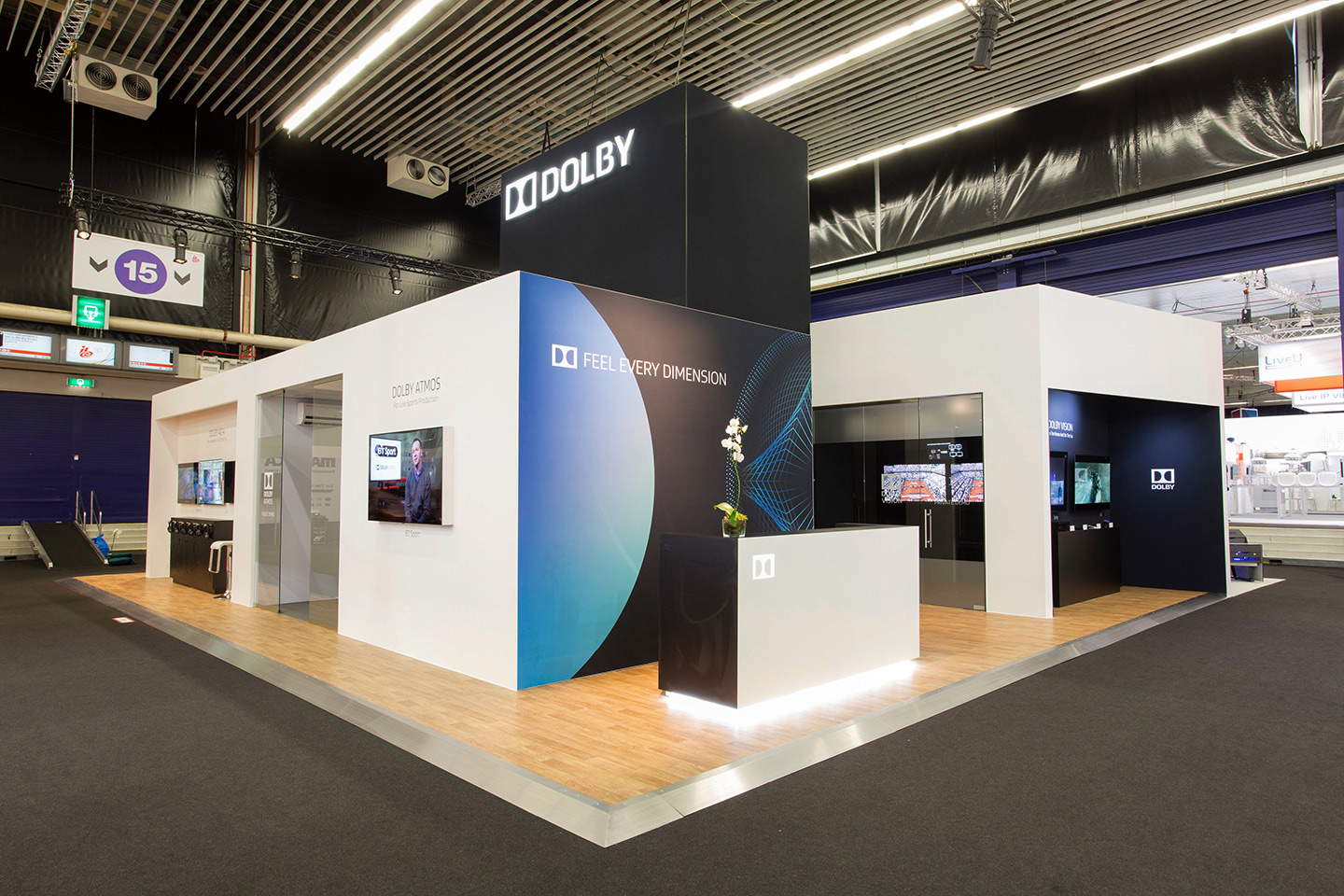
Voron’s team successfully helped Dolby bring new ideas and creative thinking to the market in the form of the Dolby Vision ‘Reveal More’ Campaign — this was the core creative idea that was developed for 2019. The essence of the reveal more campaign is that all assets from social to digital to embedded films in the products of Dolby’s B2B partners should “reveal more” in terms of the storytelling and the tangible ability of a consumer being able to see “more” vivid colors or see “more” of the stories filmed in extremely bright or dark environments.
To bring to life the intelligence the Dolby Vision, his team created an innovative set of graphic, video and interactive digital materials to describe the value that the Dolby Vision brand delivers to persuade consumers to purchase electronic equipment that contain Dolby technologies. Voron’s team also created the first Dolby ”Visonairies” campaign which seeks out and celebrates content producers and story tellers who work at the intersection of art and science.
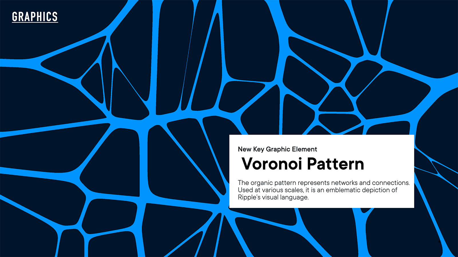
VORONOI PATTERN
One of the foundational element of Ripple’s first Brand Design System is the Voronoi Pattern. This organic pattern, which coincidentally, includes his surname, Voron, is an organic pattern that Ripple now uses to represent networks and connections across their eco-system of blockchain products. The Voronoi Pattern is now used at scale at various scales and it has become the emblematic depiction of Ripple’s visual language.
Custom Graphics Generator
Voron’s team also developed an automated custom graphic generator that creates unique Voronoi patterns based on inputting data, which is core to Ripple’s products and services. The team now creates unique graphics using their own custom Ripple visualization tool. The Ripple visualization tool is versatile with endless possibilities and visual signatures that the Ripple brand can own. This tool also allows the designers to combine themes together, and export and further develop in other applications.
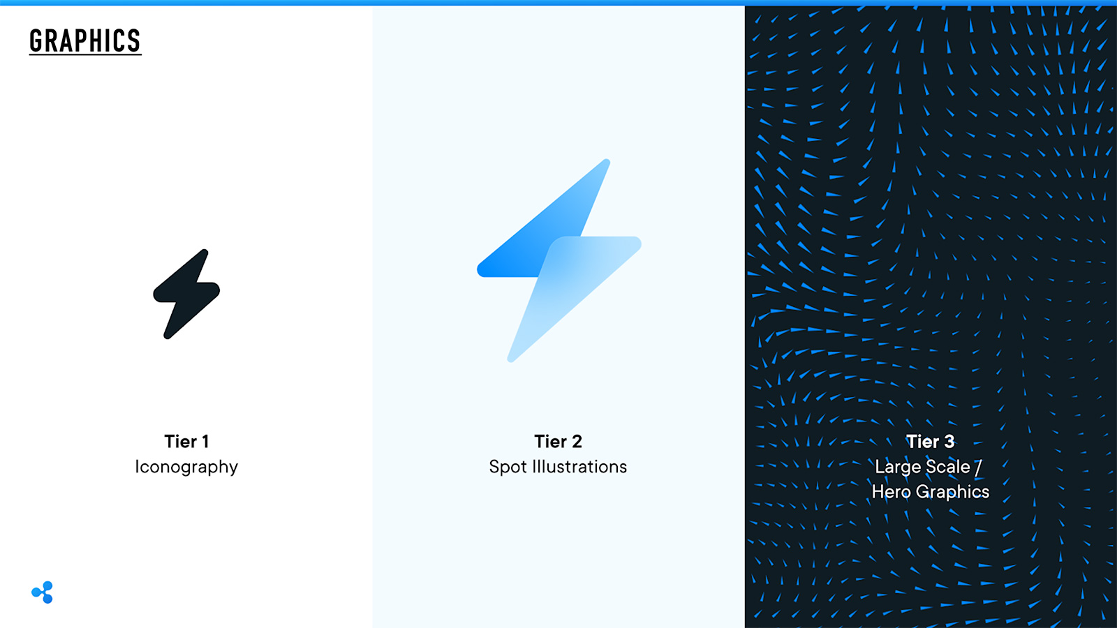
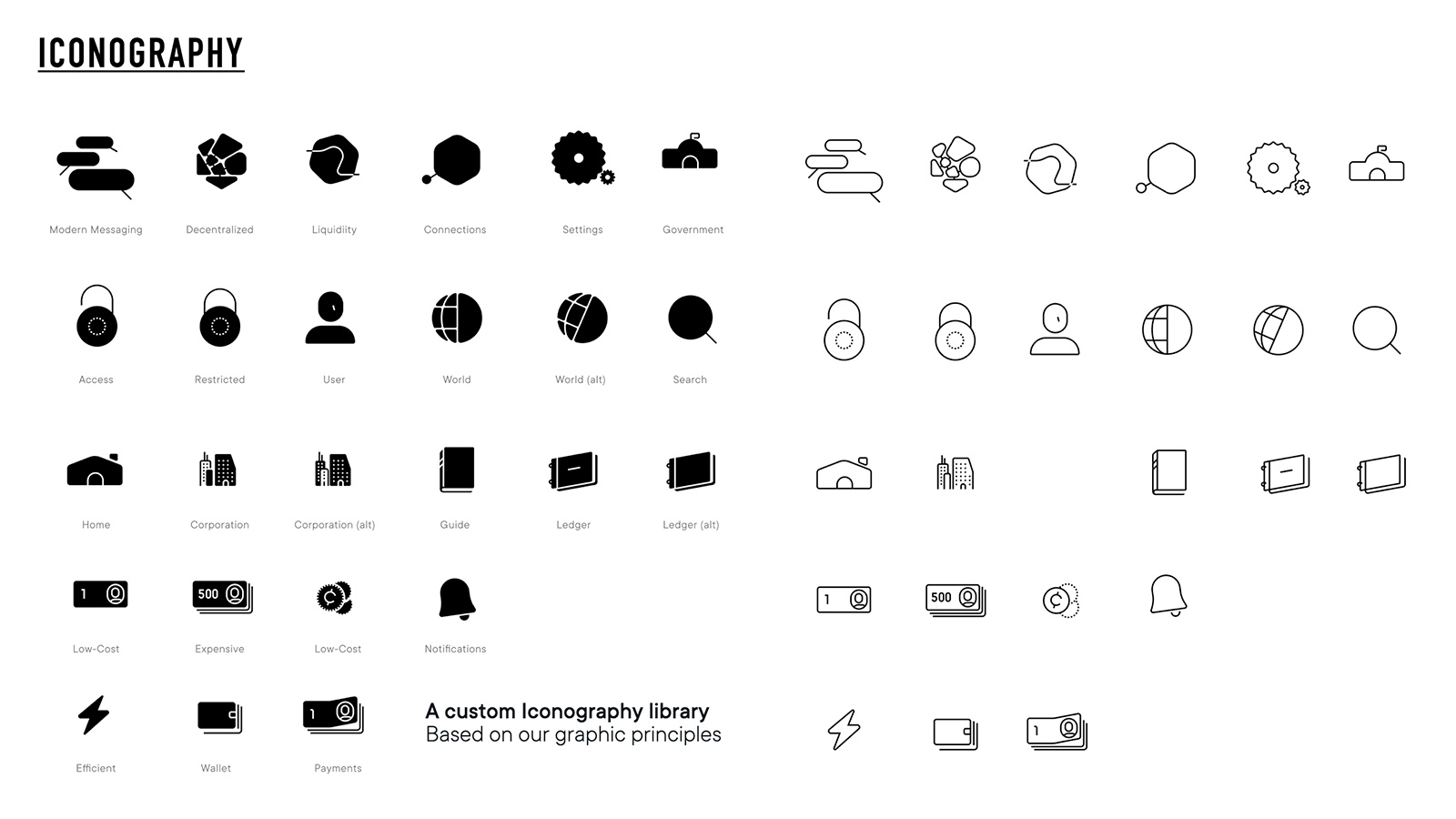
Components and Iconography
In 2021, Voron’s team created an extensive library of custom components and iconography that are now being used across both B2B financial products and crypto developer products. Iconography is the foundation of Ripple’s visual language and used in nearly every touchpoint from graphics, illustration and product design. The team created a set that reflects Ripple's unique brand personality with precision and action without sacrificing clarity. Icons are available in two sets, System and Illustrative.
Personality: Metaphor objects accentuate dimensions.
System: Icons provide the grounding for Ripple's interface language. They are designed to be visible, clear, consistent and flexible. System icons are used in product UI to reinforce ideas, content and features.
BRAND strategy
The Brand Design Strategy function that Voron built at Ripple has served as the touchstone for all creative inspiration and decision making for the brand since early 2020. During his tenure at the company, the team rebranded all products and services for both business groups, RippleX and RippleNet. In addition, his team updated the corporate mission statement and corporate position content. Ripple Vision is “The Internet of Value: Enable the world to move value like information moves today. Their Mission is “Enable payments everywhere, every way for everyone.” Ripple’s Positioning is “For financial services companies, and the communities who interact with them, Ripple is the visionary builder in financial services that delivers large-scale, high-performance solutions to global communities so our partners excel in an improved financial system that supports a better, more inclusive world."
For creative executions, Voron’s team redefined how the company communicated so that were perceived as both an experienced and trusted partner in the crypto technology space, with the vision needed to imagine and build the solutions required in a fast-changing landscape.To demonstrate this, his brand stratetgy team developed the Core Creative Idea of “Vision in Action” to guide all future creative, regardless of medium. The duality of this Core Creative Idea plays on the notion that one element inspires another, and something better emerges. One element can cause the other, direct the other, flow through the other, or cycle with the other.
Voron’s brand strategy team also developed three new Brand Character traits that brought these ideas to life:
Visionary: A sweeping and decades-deep view of the financial landscape, with the insight, commitment and expertise required in every relevant area for long-term success.
Pragmatic Efficiency: Oriented within real-world constraints and a mindset of leveraging what works, improving what can be made better, and replacing what is broken.
Optimistic: A positive, rallying belief in Ripple's collective ability to achieve a better future that cuts through cynicism, complacency and friction to attract partners and inspire progress.
Creative clarity briefs
Great creative starts with insightful, clear strategy. Whether working with internal marketing teams or external agencies, we needed a single briefing document for each brand that would ensure consistent communications.
Voron’s team built a process referred to as creative clarity briefs to articulate the creative strategy on each platform brand with a “red thread” from marketing objectives through insight and core creative idea to touchpoint mapping, messaging, and creative execution.
His team found that creating these documents brings teams together around a single idea and execution style, and the strategies they map out have started to drive more cohesive and considered creative work. They also provide a readymade capture of all the essentials for any external agency we work with, so any extensions of our teams also have the knowledge they need to drive a coherent strategy.
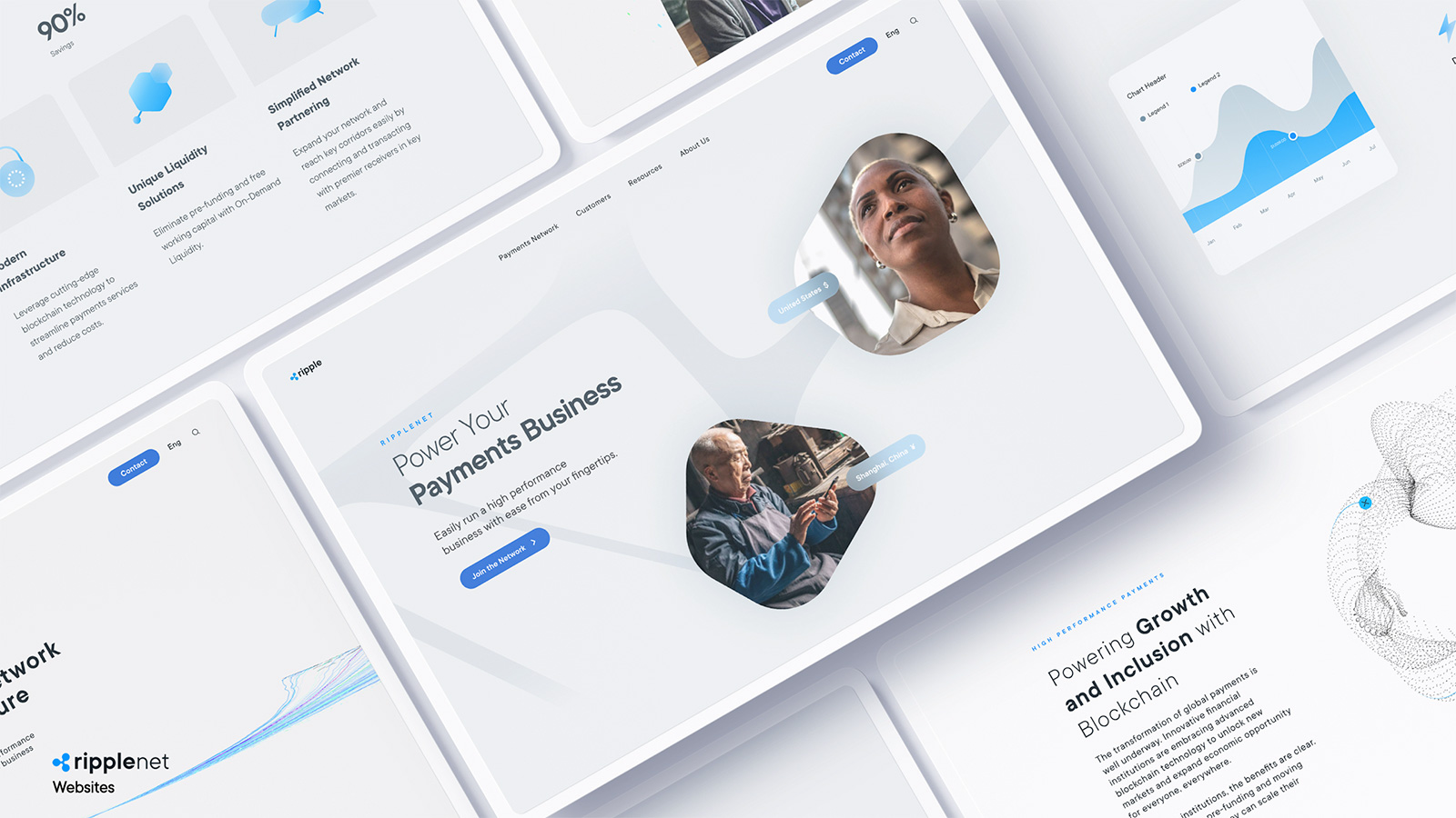
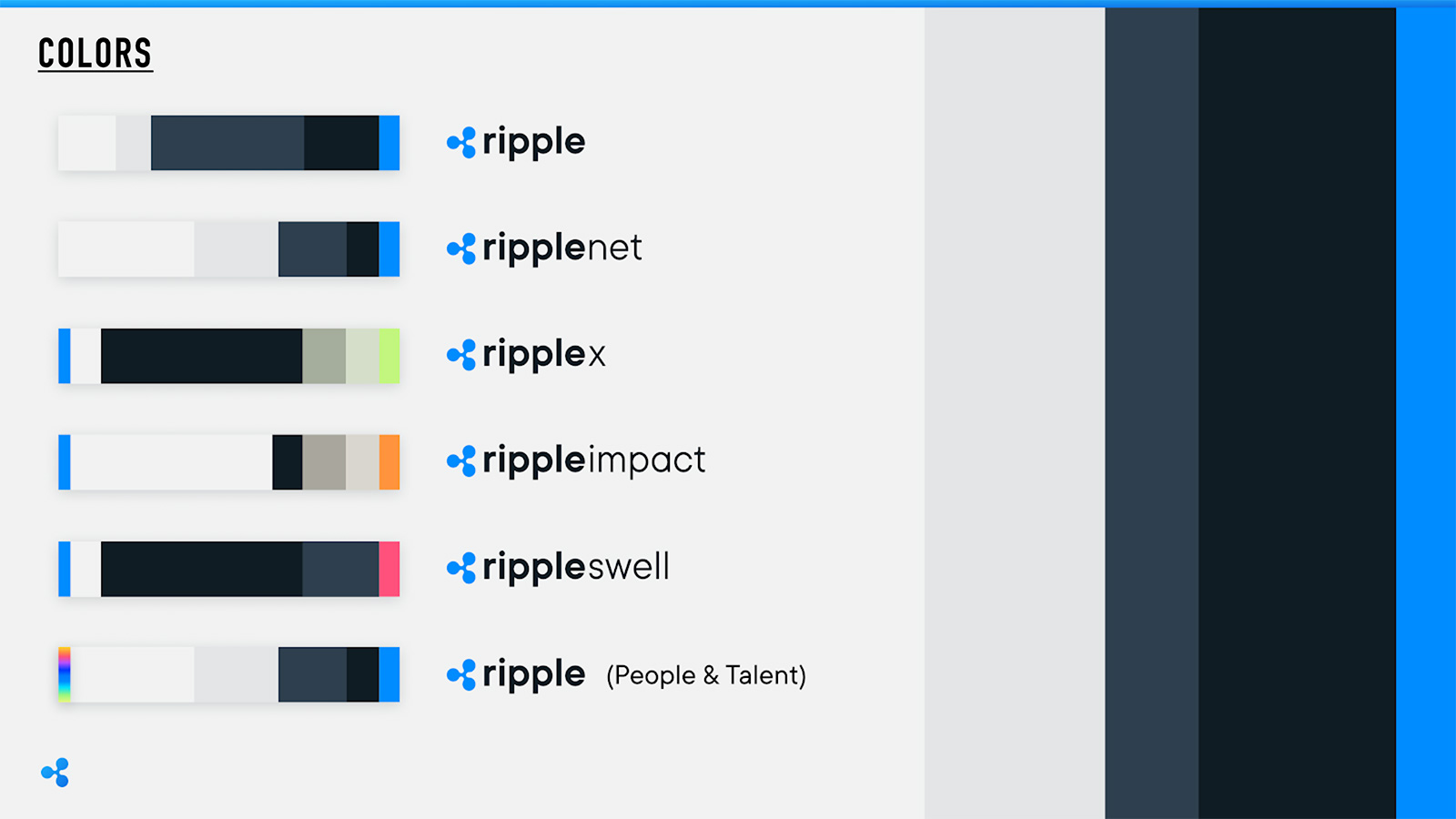
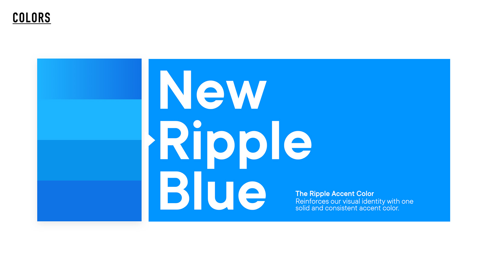
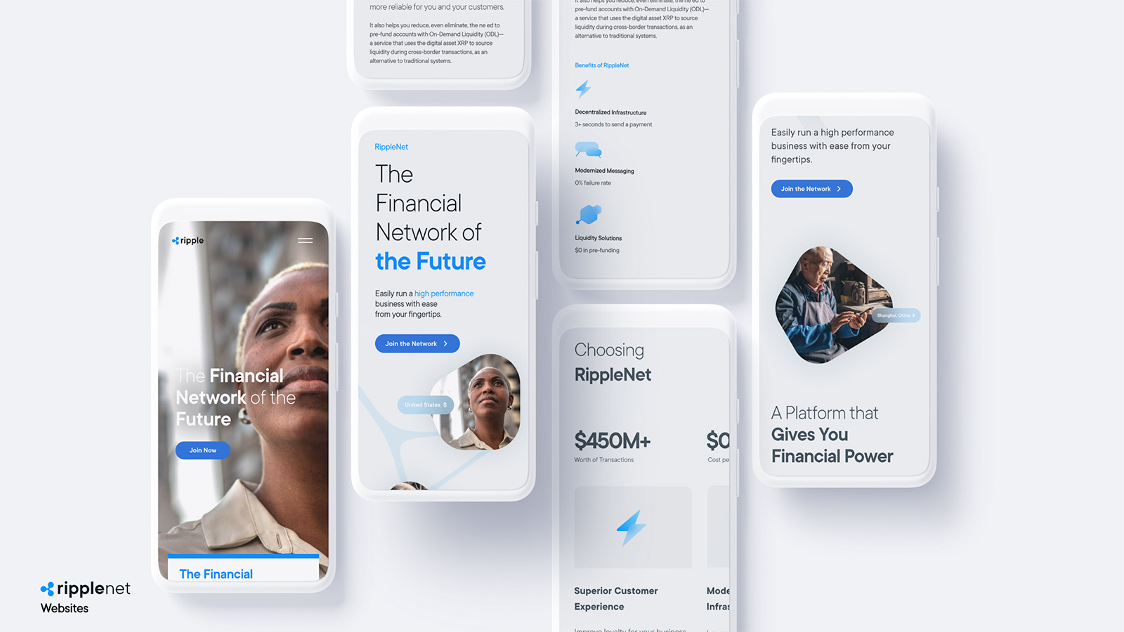
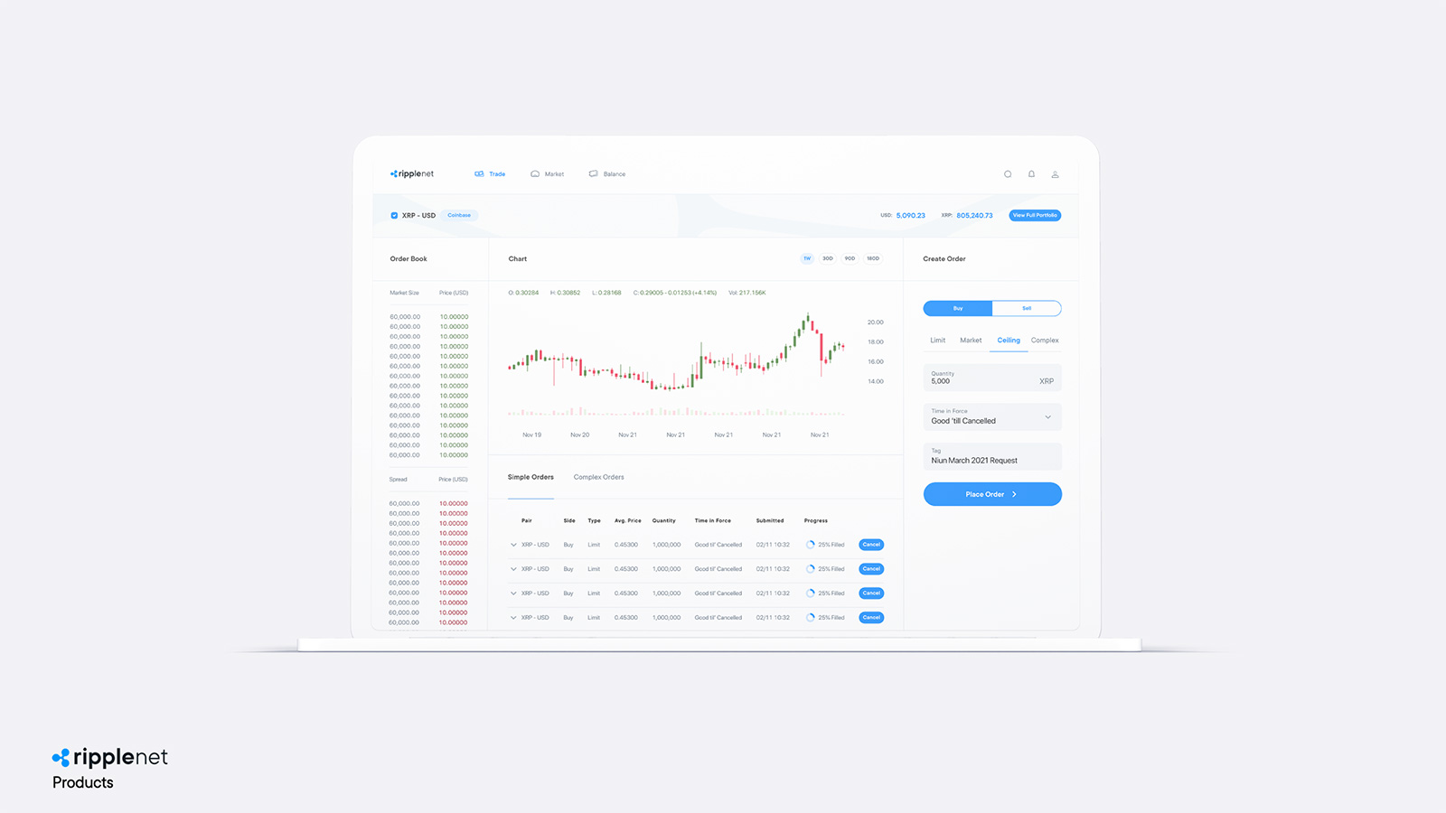
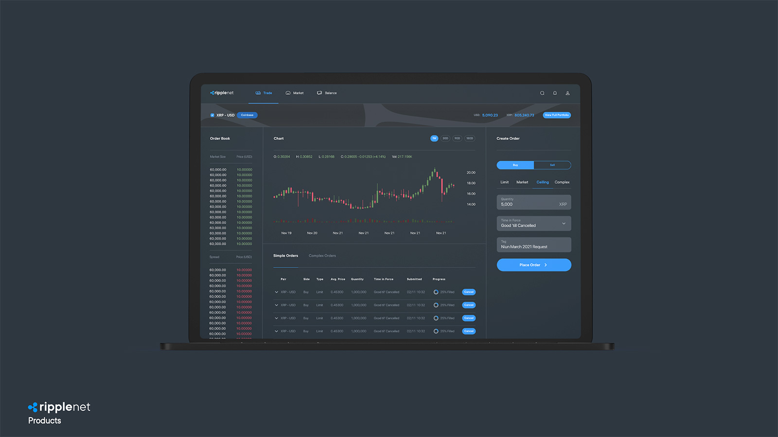
RippleNet
Primary Palette: The primary palette for RippleNet product family is black, white, grays and blue. Because RippleNet is the company's flagship product and its target audience is financial institutions, RippleNet utilizes the neutral colors prominently and the blue sparingly, as it is used at the corporate level.
Extended Palette: The extended palette contains tints and shades with subtle shifts in value that helps organize content in applications like charts, graphs, illustrations and web page sections.
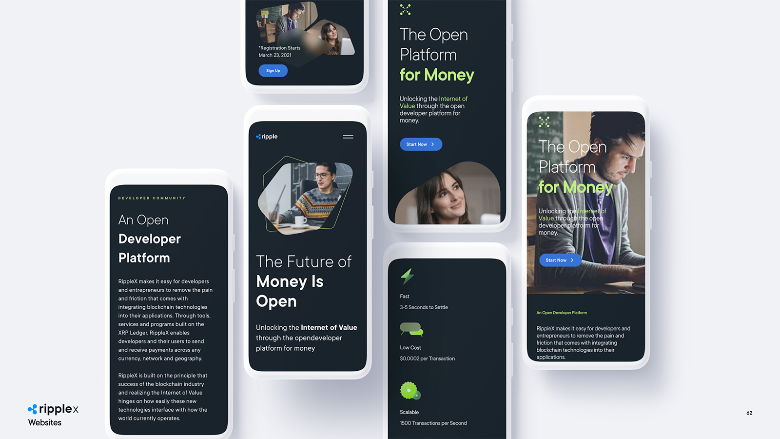
RIPPLEX
Primary Palette: The primary palette for RippleX consists of black, white, grays and lime green. Because the brand should communicate technical innovation and appeal to developers, the palette is inspired by computer terminals. Black and grays is utilized across all brand communications, products and experiences. The lime green is utilized purposefully and is reserved as the primary action color to guide the eye and highlight important details.
Extended Palette: The extended palette is a range of tints and shades with subtle shifts in value to help organize content.
Other Work


Ripple Got It CampaignRipple
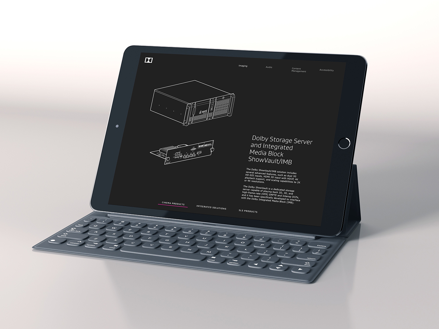
Dolby Brand Design SystemPayID Product & Brand Design
Dolby UX/UI DesignDolby
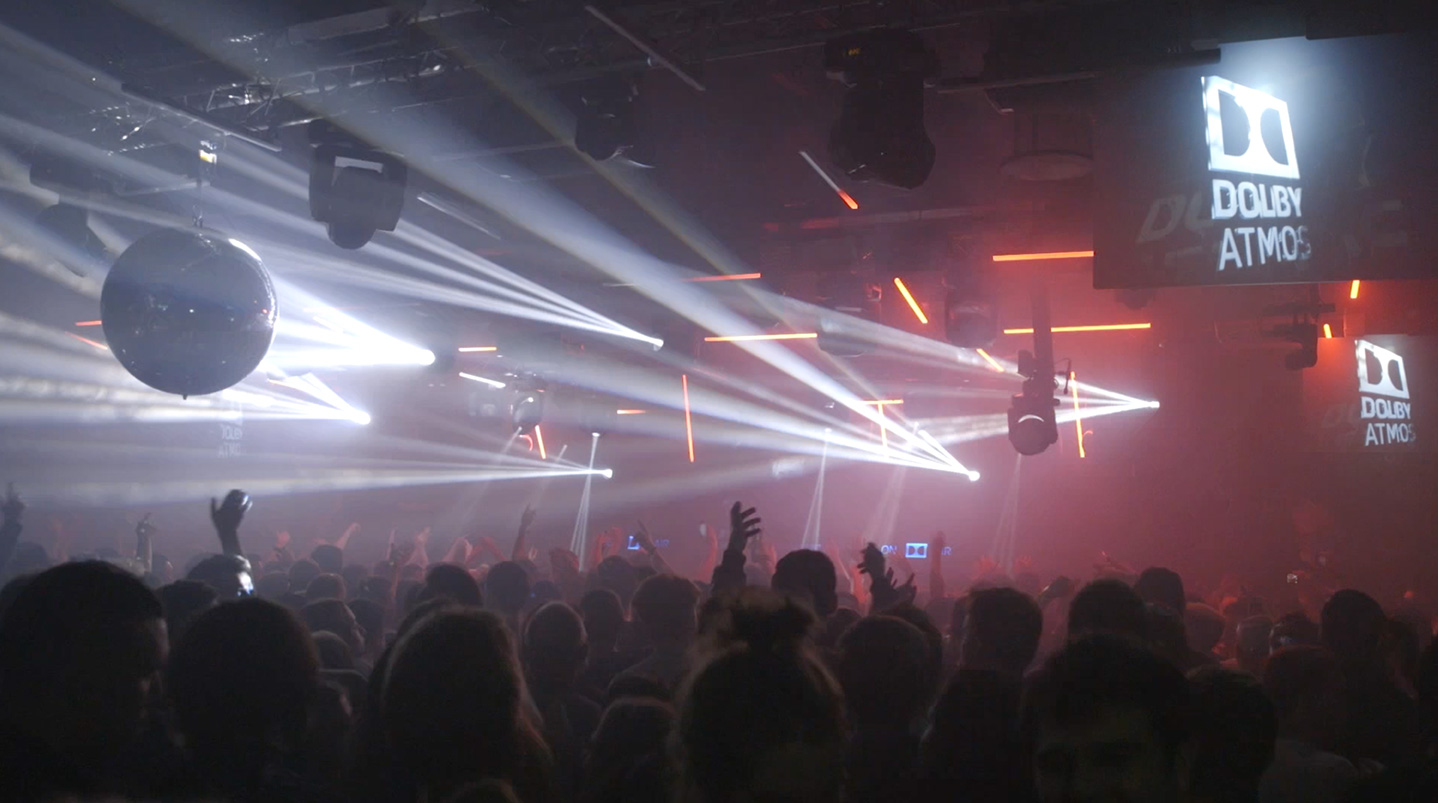
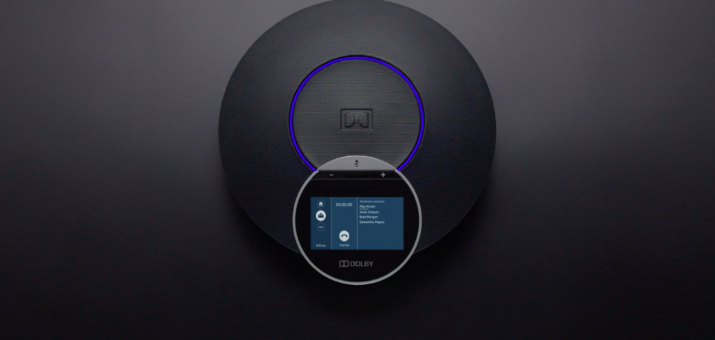
Dolby VoiceDolby


EscapeDolby


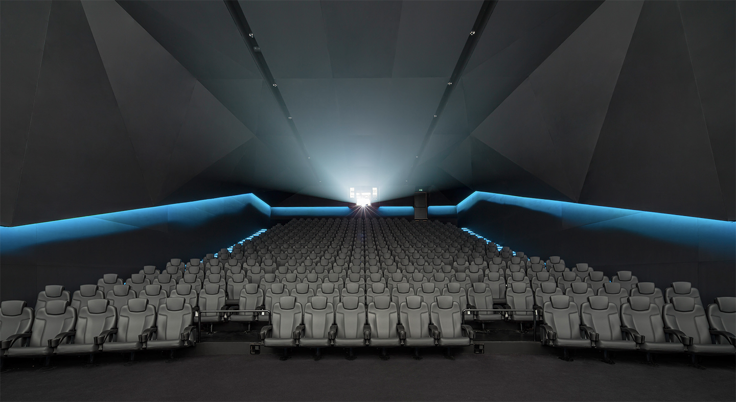
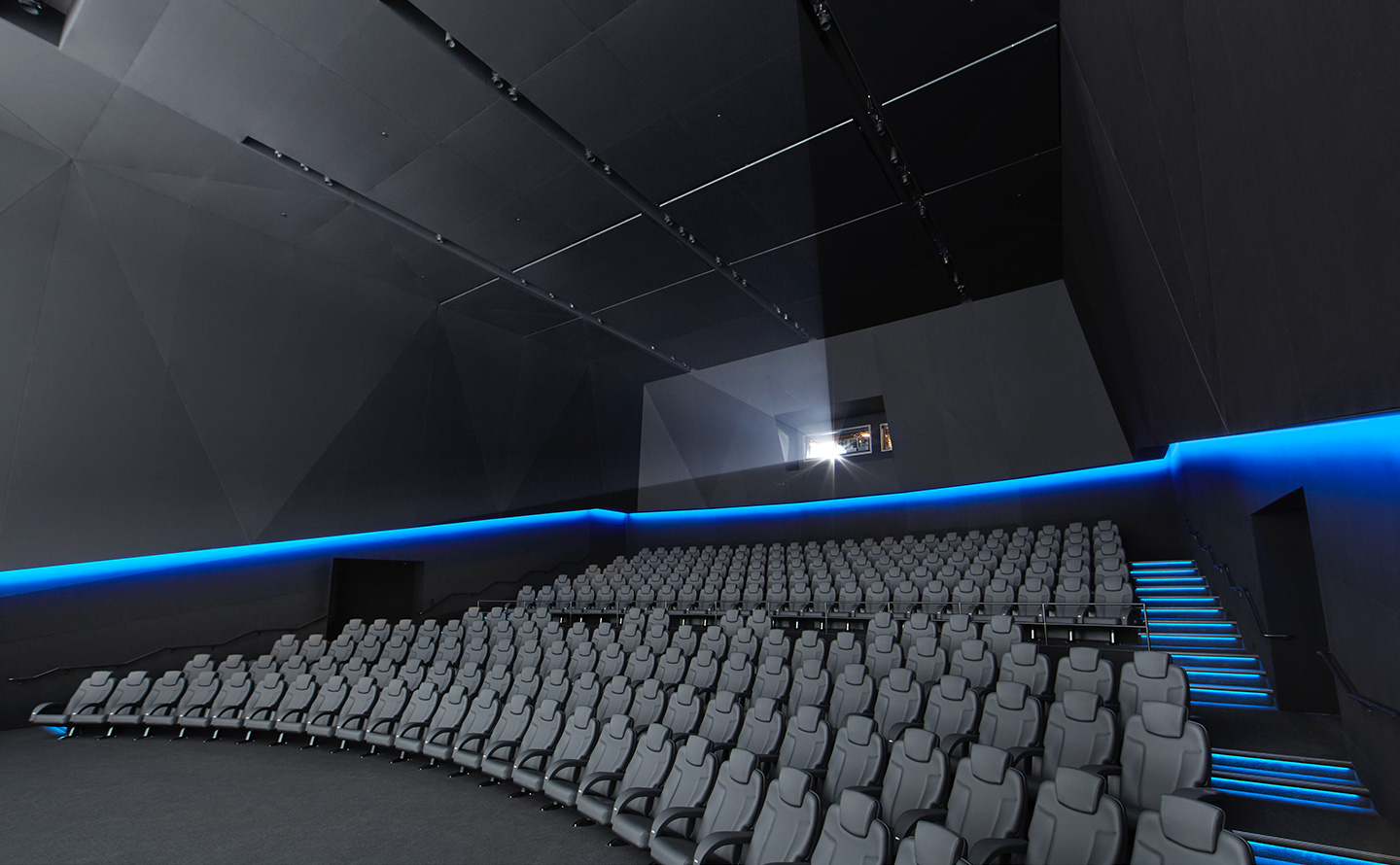
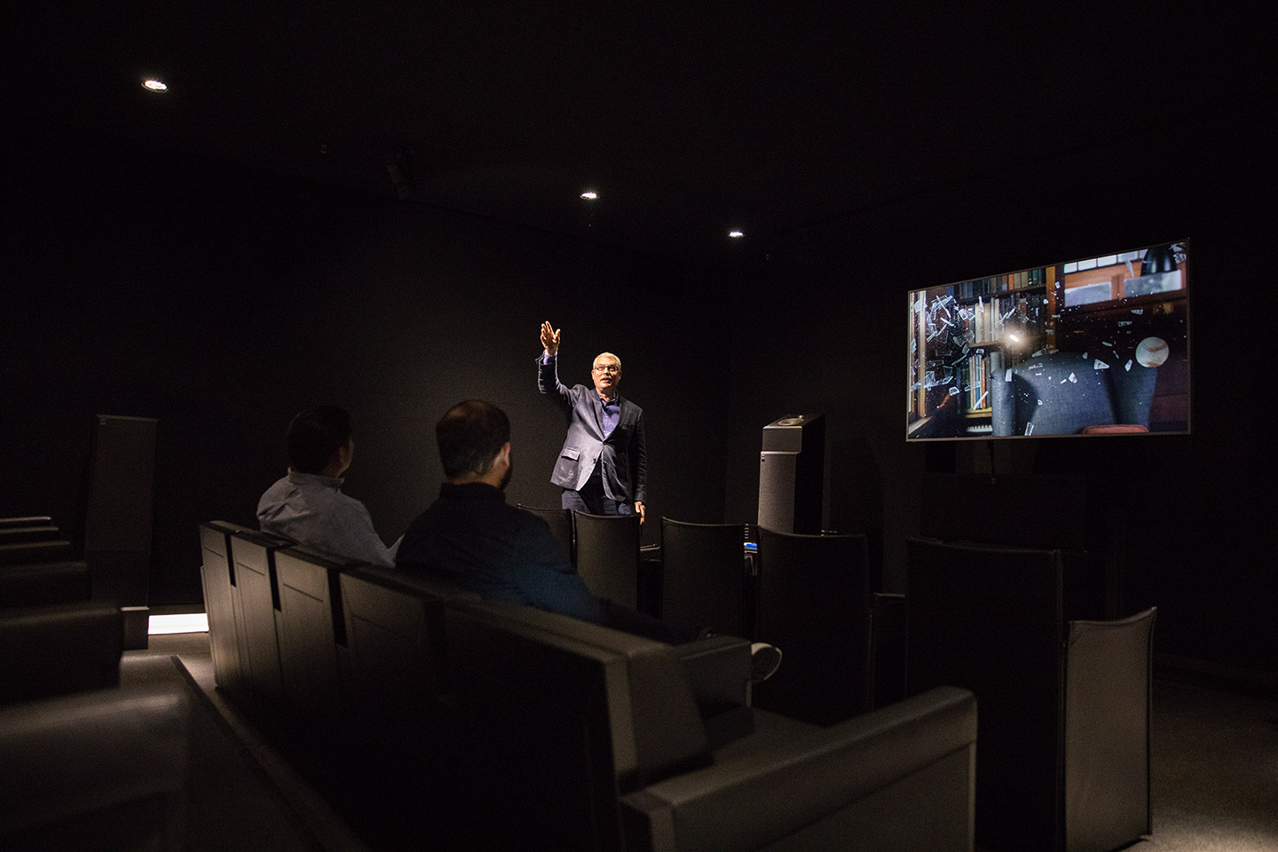
Dolby CinemaDolby

SilentDolby
Dolby SohoDolby

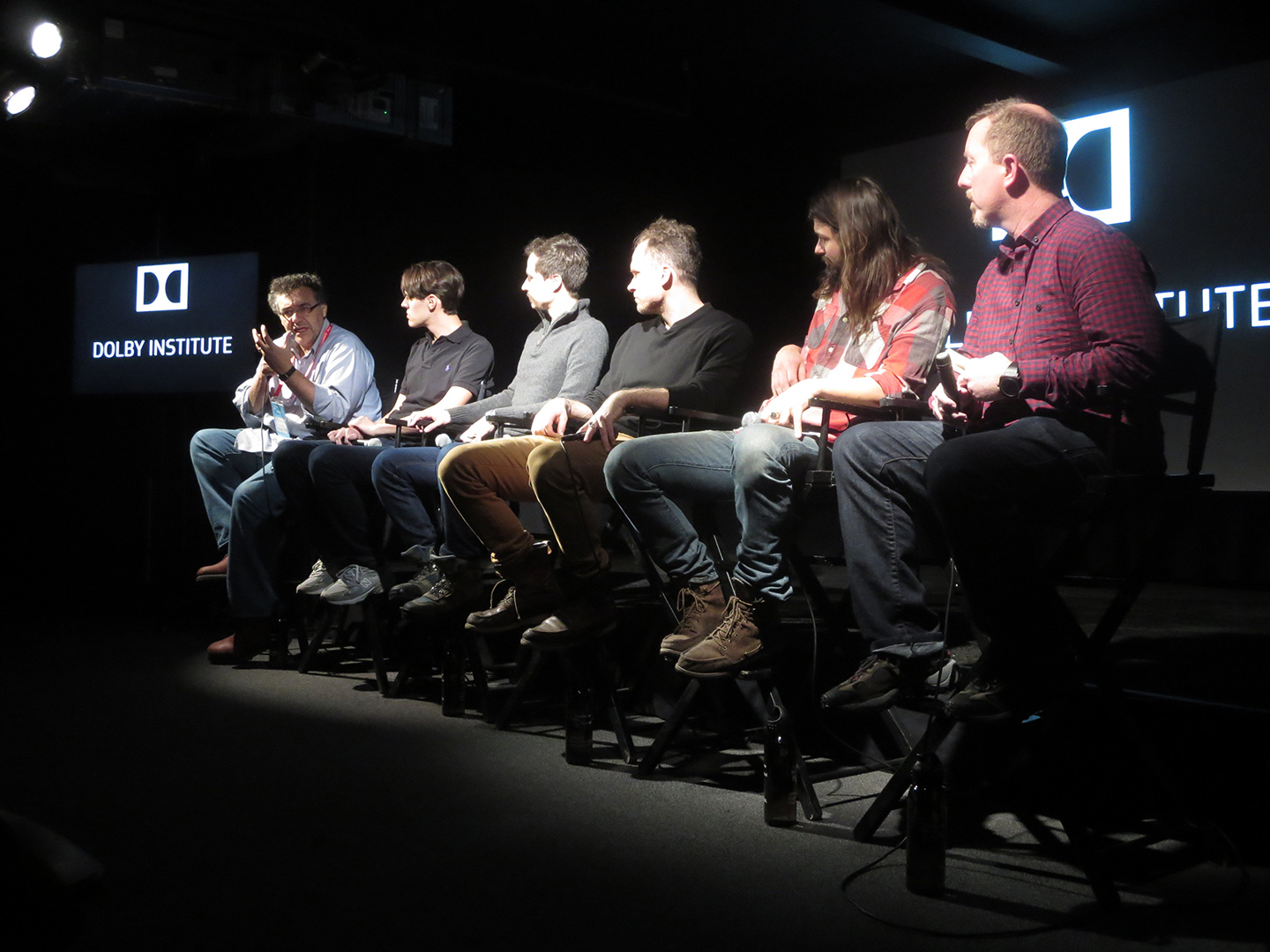
Dolby InstituteDolby
Dolby Art SeriesDolby
Dolby PhotographyDolby
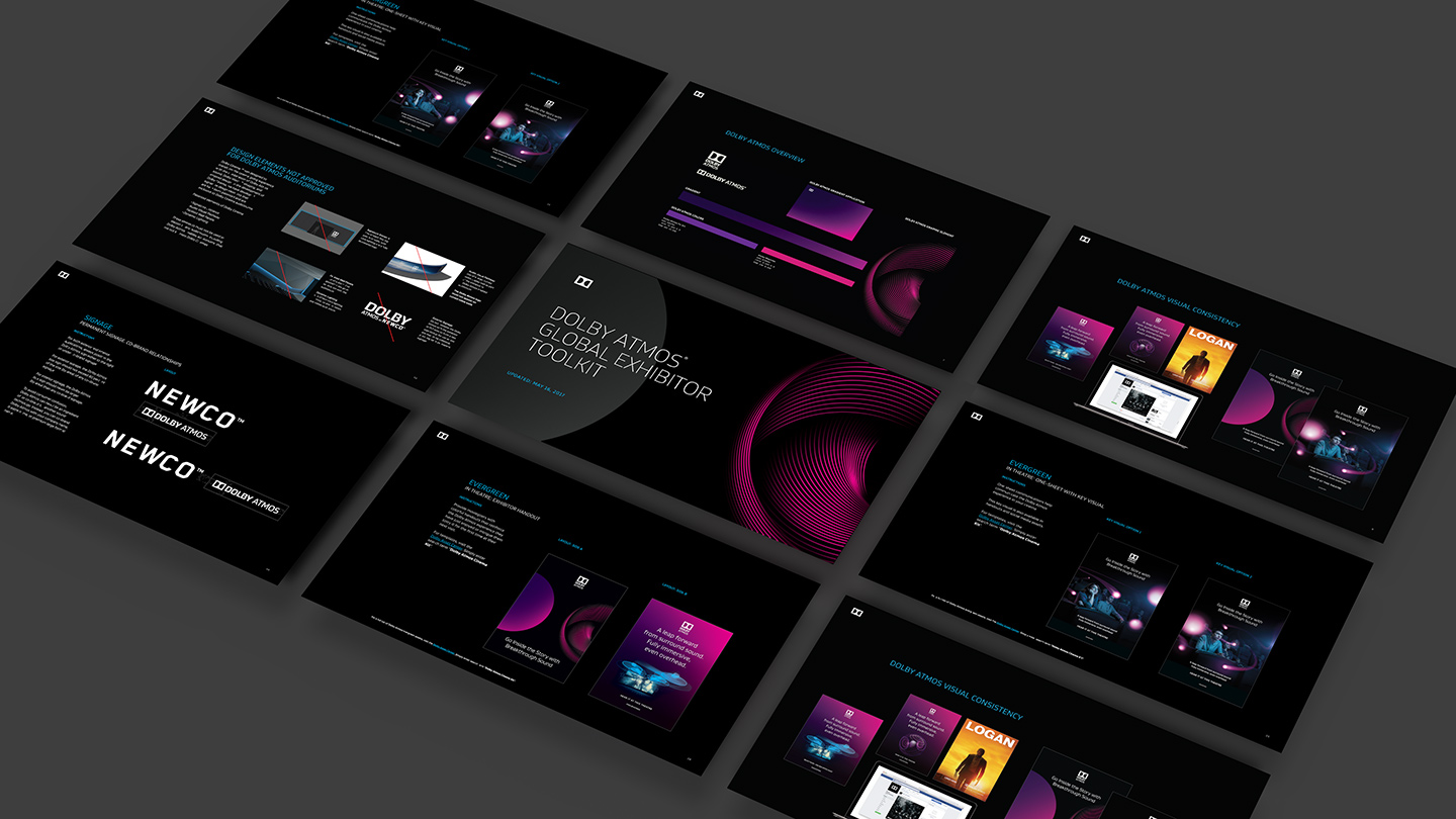
Partners ToolkitsDolby
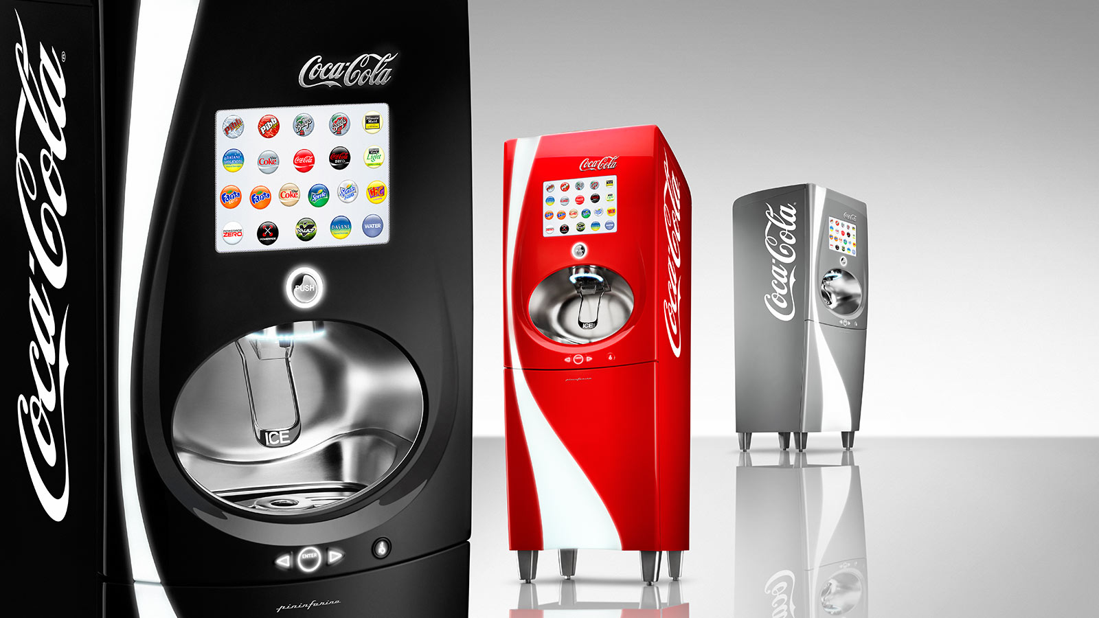
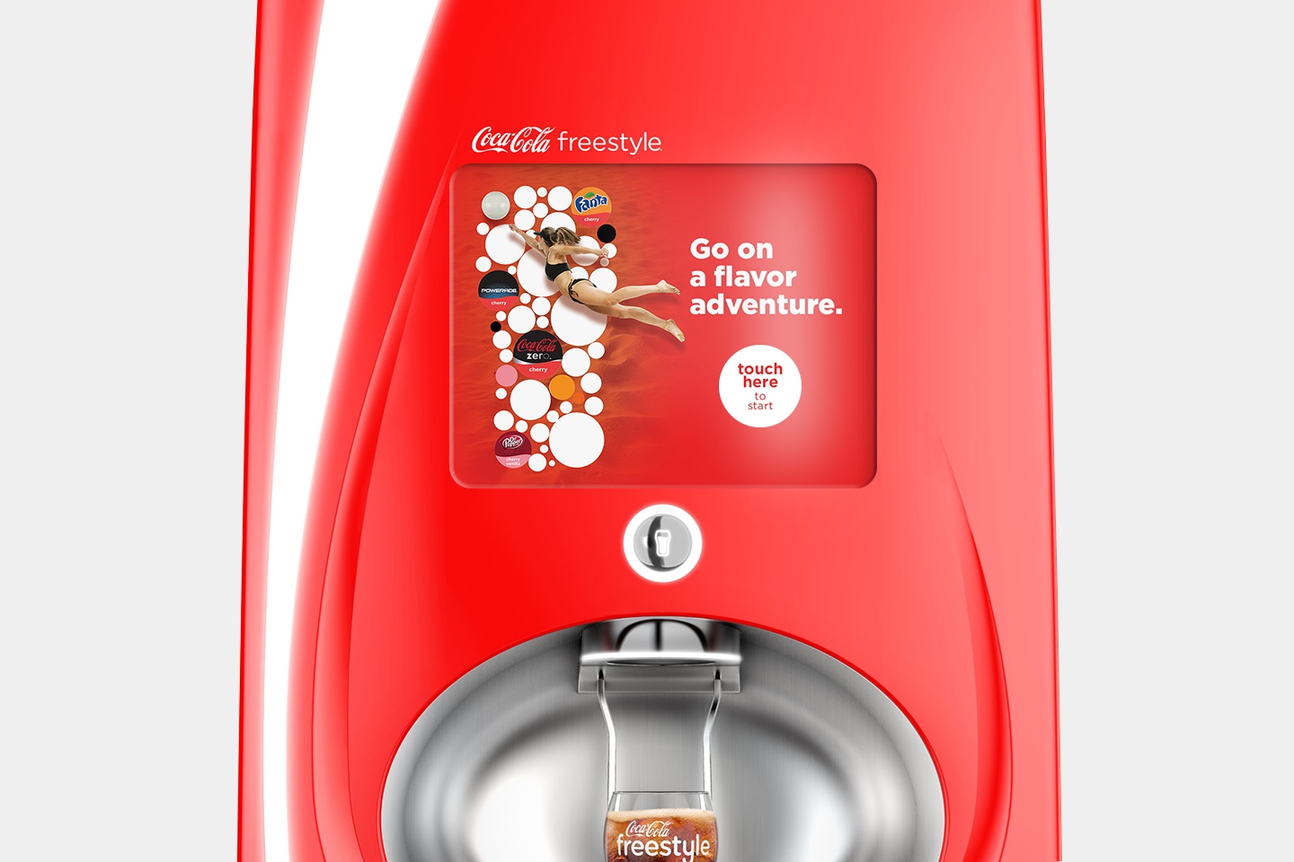
Coca-Cola FreestyleCoca-Cola
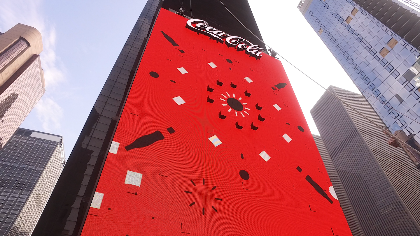
Times Square Interactive BillboardCoca-Cola

Coke Brand Design SystemCoca-Cola
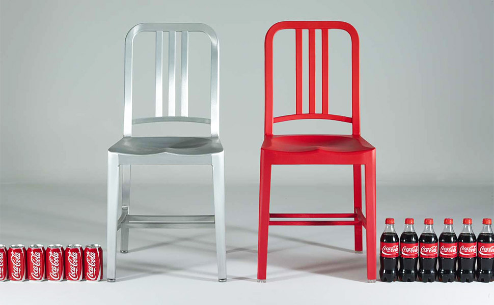
EMECO COKE 111 NAVY CHAIRCoca-Cola
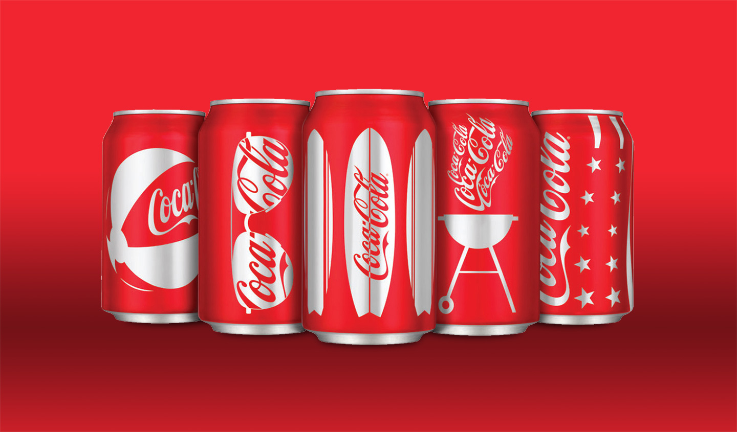
Coca-Cola PackagingCoca-Cola
Coca-Cola EquipmentCoca-Cola
Coca-Cola Digital DesignCoca-Cola

Apple ArchiveApple
Apple is a registered trademark of Apple Inc, Coca-Cola is a registered trademark of The Coca-Cola Company, Dolby and the double-D symbol are registered trademarks of Dolby Laboratories.Hey there, this is the default text for a new paragraph. Feel free to edit this paragraph by clicking on the yellow edit icon. After you are done just click on the yellow checkmark button on the top right. Have Fun!